
Ajaib
Designing USD Wallet to Eliminate Hidden Costs in US Stock Trading
UI/UX, Product Design, Mobile Apps Design
How we redesigned the money flow for active US stock traders on Ajaib, eliminating the silent 2% tax that eroded every round-trip trade.
2025
Product Designer
Figma, Jitter, Claude, ChatGPT
Platforms
Mobile App (iOS & Android)
The problem hiding in plain sight
Ajaib's US Stocks product was built on an IDR-first architecture. Every rupiah a user invested was converted to USD to buy stocks, and every time they sold, proceeds were converted right back to IDR. On the surface, seamless. But look closer at an active trader's account.
"FX spread on PnL" was a top-3 customer complaint on CS tickets. Traders weren't losing money on bad picks — they were losing it in the plumbing.
The 1% FX fee, twice per trade
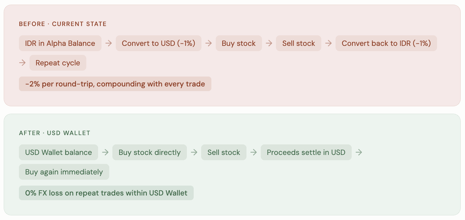
Buy 👉 sell a position and return to cash? That's a 2% round-trip toll on every cycle, before any market movement.
Friction kills trading velocity
The power user cohort showed worse TPV retention. The conversion overhead discouraged repeat trading; users simply stopped coming back.
Competitors have already solved this
Pluang, GoTrade, and Reku all allowed USD storage. Ajaib was losing active traders to rivals on a foundational product feature.
Future product inconsistency
With CFD & Forex Wallet on the roadmap, having no USD storage for US Stocks would create a confusing, fragmented experience across Ajaib's ecosystem.
The before & after of a trade cycle
To make the problem tangible, I mapped the money flow for an active trader doing a single round-trip, selling one position to move into another.
When a “feature” becomes a system redesign
Introducing USD Wallet quickly evolved into a full-system redesign challenge. What initially sounded straightforward, “let users keep USD,” touched almost every layer of the product and operational infrastructure.
The experience is now needed to support:
Dual balances between IDR and USD
New buying power calculations
Settlement handling
Currency conversion edge cases
Failure states during transactions
Coordination between investment and payment systems
This wasn’t simply adding a wallet UI. It meant redefining how money moved through the system. The challenge also became deeply conceptual.
Financial products are naturally complex, and unlike consumer apps, many parts of that complexity cannot actually be removed. Exchange rates, settlement timing, balance states, and conversion mechanics are real operational constraints.
The question was no longer:
“How do we simplify this?”
Instead, it became:
“How do we make this understandable?”
That insight shaped the entire design direction.
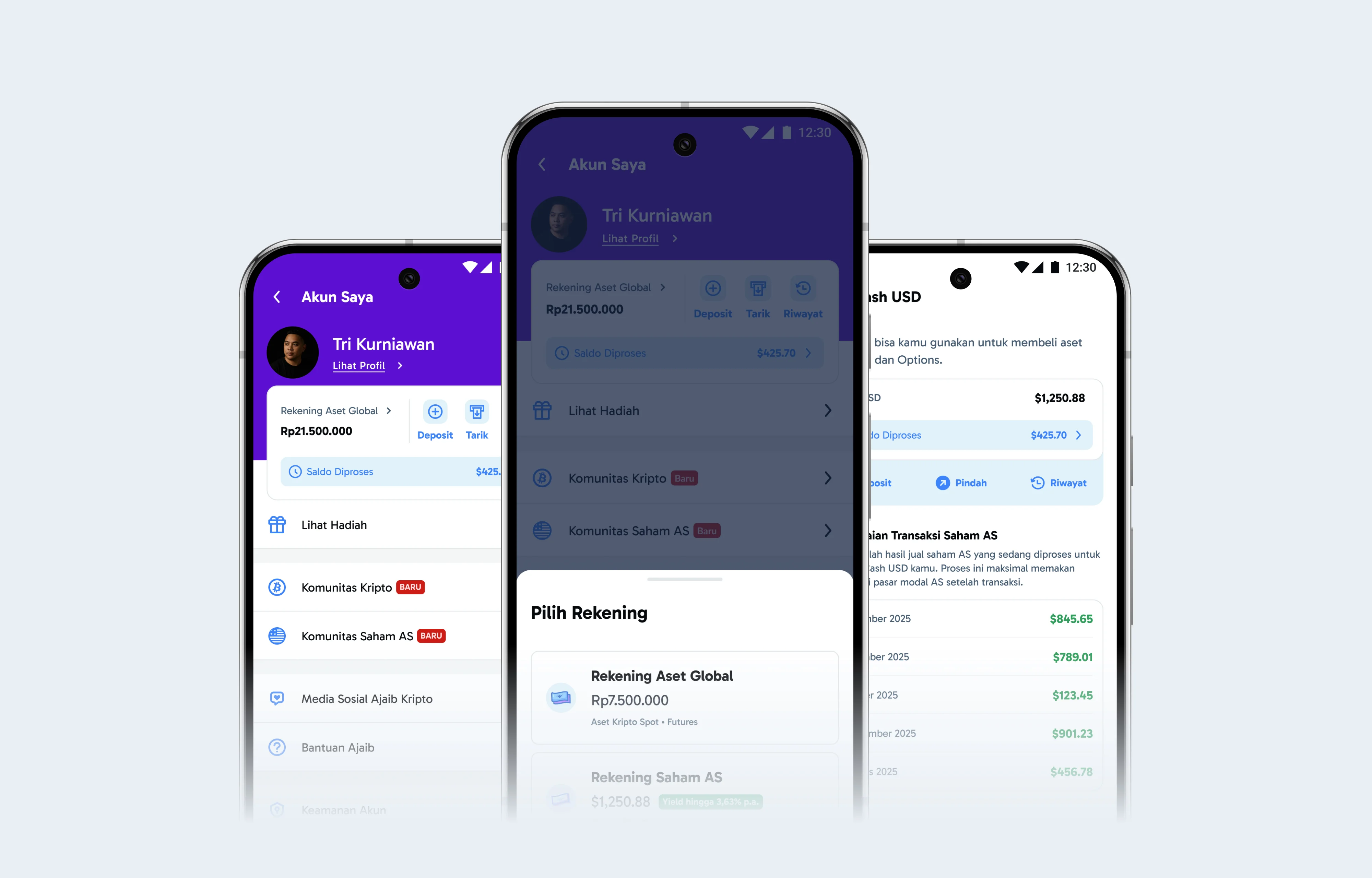
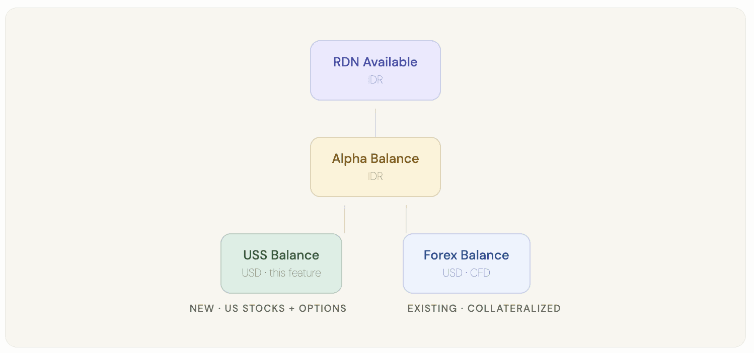
Architecture at a glance
The wallet architecture needed to be clear to users, even when explained through UI copy. Understanding where money lives and how it flows determines trust.
Designing Around Mental Models, Not Just Flows
One of the most important realizations during this project was that users didn’t necessarily need more control. They needed a clearer mental model of their money.
When users don’t understand:
where their money is stored,
how it moves,
what currency it exists in,
or how much they can actually use,
They hesitate. And in trading products, hesitation directly impacts activity, engagement, and retention. Instead of hiding the system complexity, we decided to expose it carefully and intentionally.
The goal wasn’t to make the system look simple. The goal was to make the logic feel trustworthy.
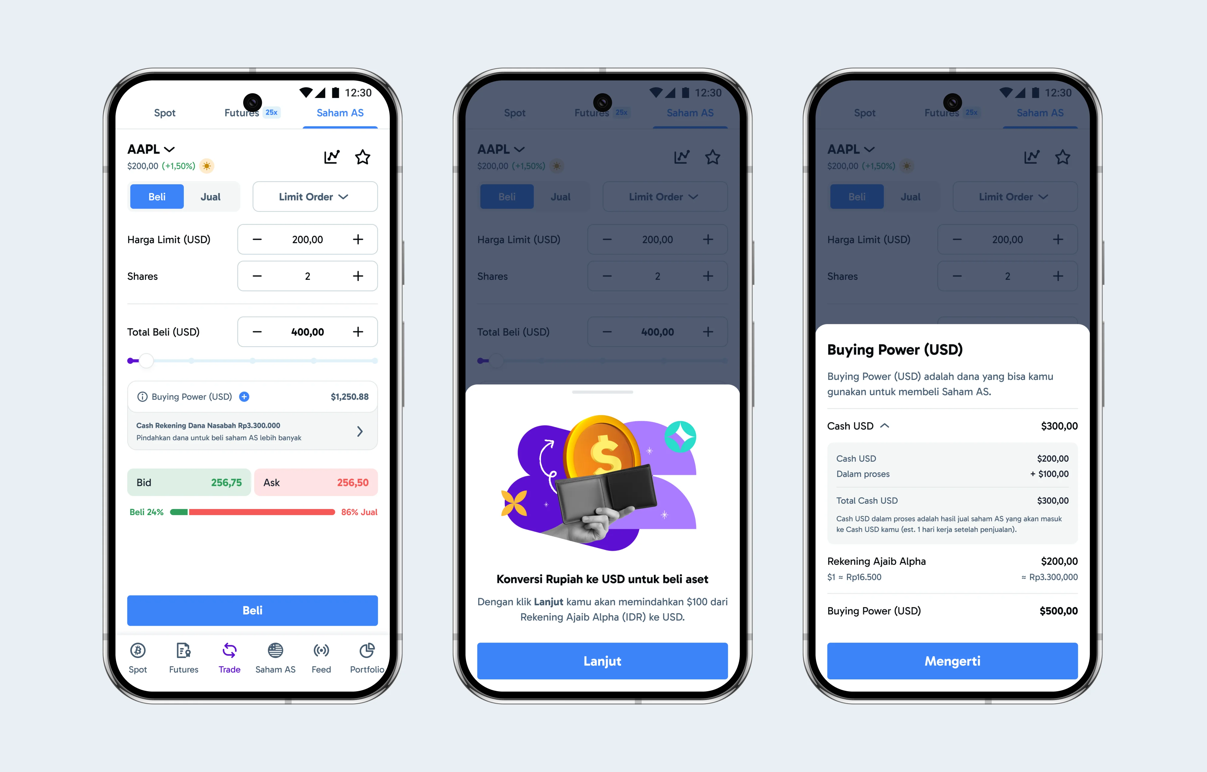
Making buying power feel trustworthy
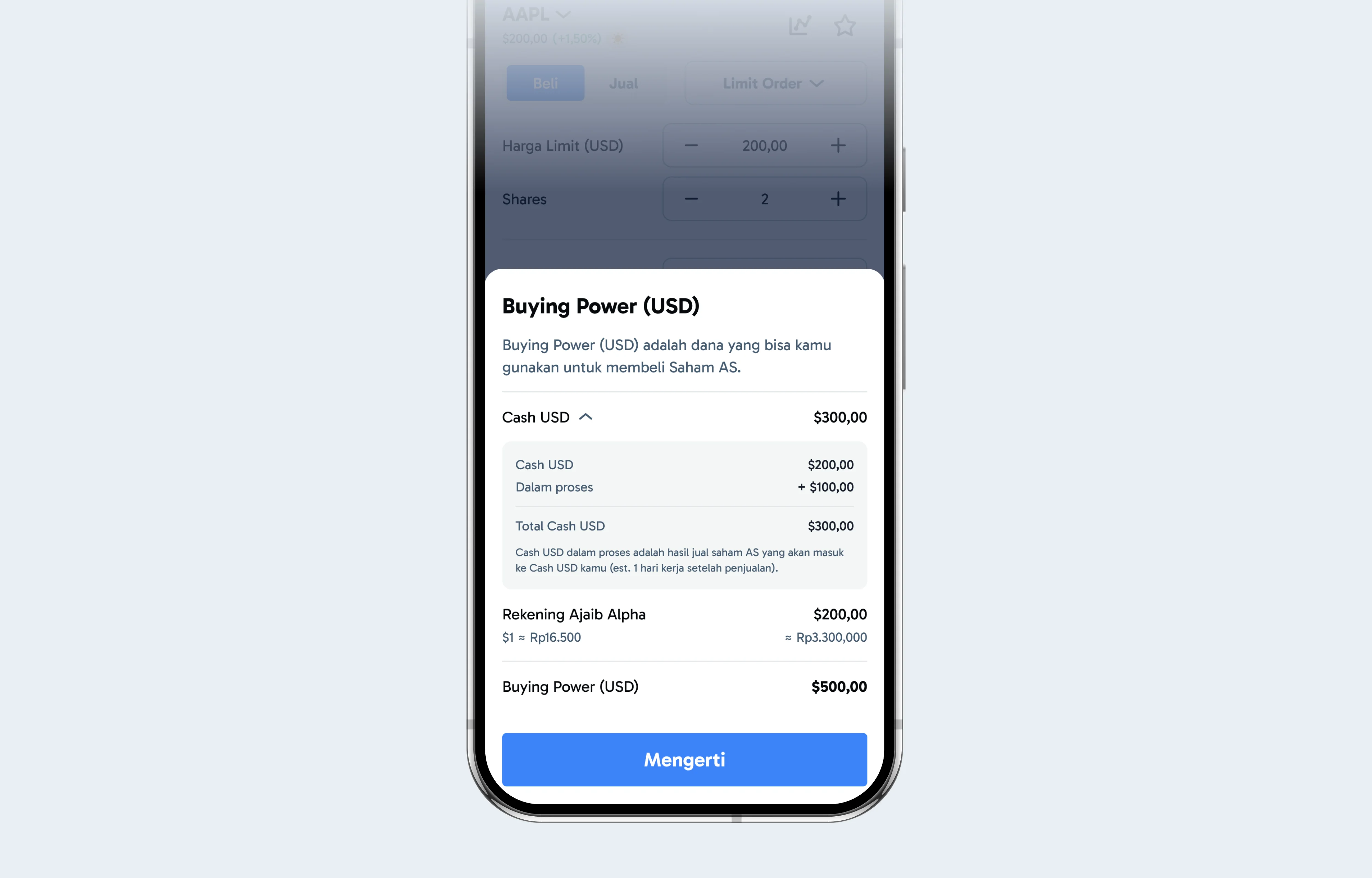
One of the most critical redesign areas was Buying Power. Previously, the number felt opaque. Users saw a balance, but often didn’t understand how it was calculated or why it changed. With USD Wallet, Buying Power now came from two sources:
USD Wallet balance
IDR balance converted into USD
Rather than hiding this logic, we surfaced it clearly
We broke down the calculation structure, showed how each component contributed to the final amount, and made the relationship between balances more transparent.
This was an important shift in philosophy
In many financial products, teams try to reduce cognitive load by hiding calculations. But hiding financial logic can sometimes reduce trust instead of increasing it.
Users don’t need every detail upfront. But they do need confidence that the numbers are explainable.
Guiding conversion instead of letting users fail
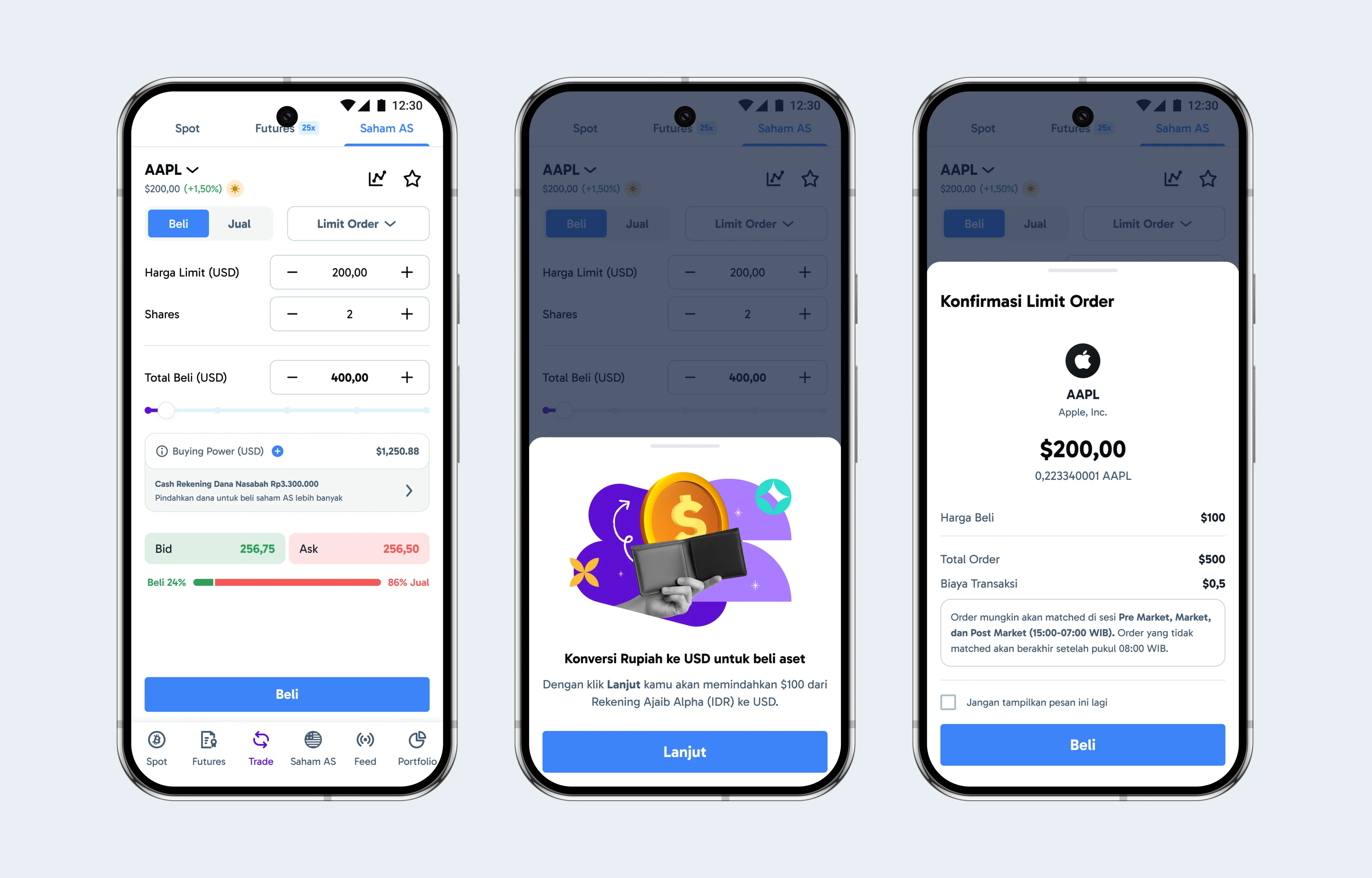
Another major design consideration was handling insufficient USD balance scenarios. A common failure pattern in trading apps is allowing users to proceed until they suddenly hit an error state. That interruption creates frustration precisely at the moment users are trying to take action.
Instead of treating conversion as an isolated utility flow, we integrated it directly into the trading experience. When users lacked enough USD to place an order, the system proactively guided them by:
showing the exact required conversion amount,
prompting the action contextually,
and returning them seamlessly back into the trade flow afterward.
This transformed conversion from a disruptive task into a guided continuation of the user journey. The goal was to resolve friction before users emotionally experienced it as friction.
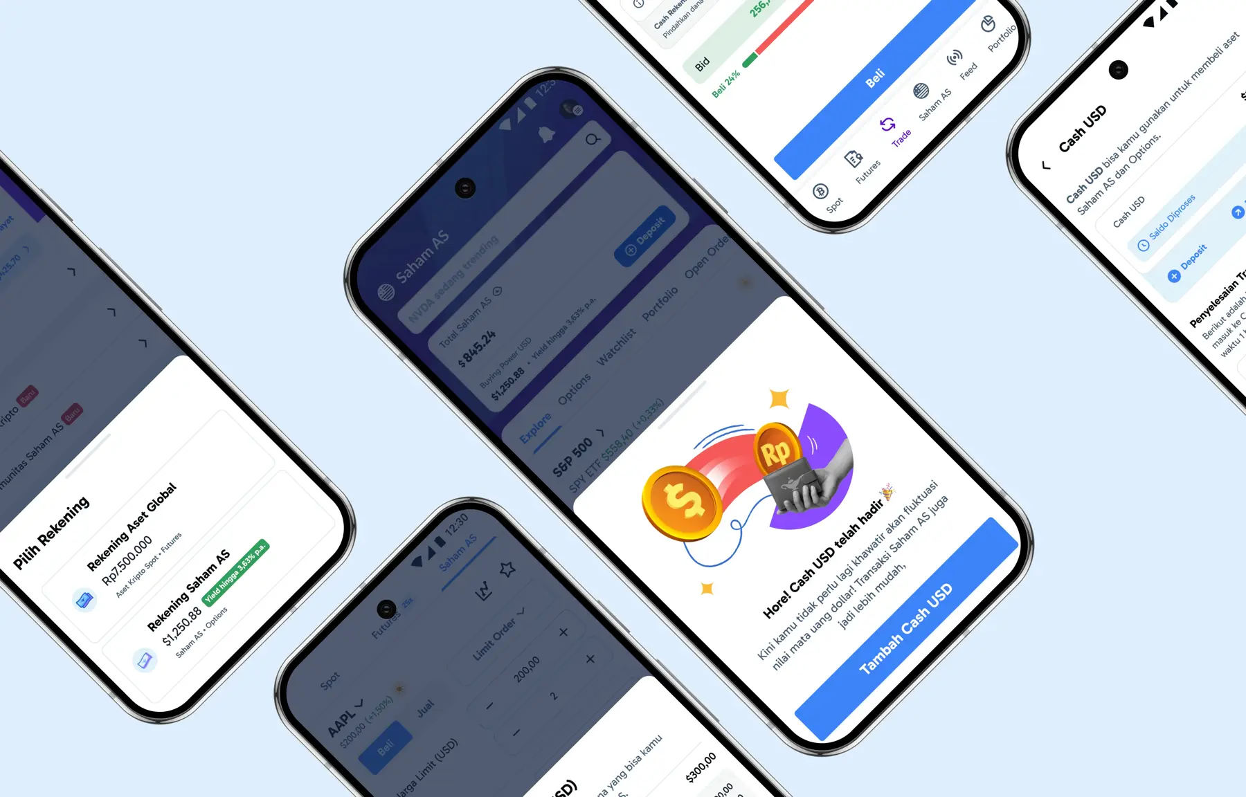
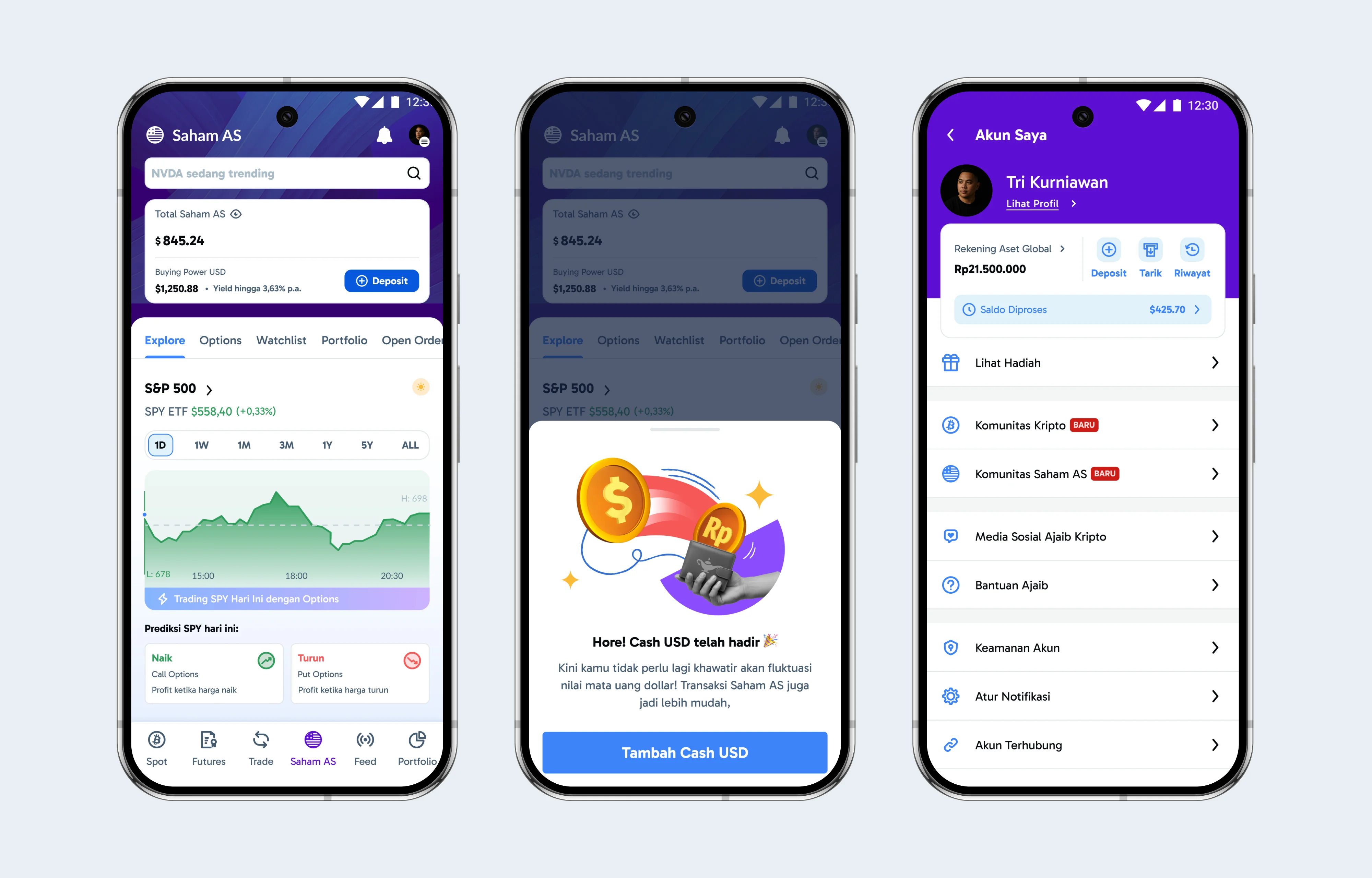
Treating USD Wallet like a product, not a feature
Another important decision was positioning USD Wallet as a product introduction rather than a hidden feature release. Because this fundamentally changed how money worked in US Stocks, users needed education early. We introduced:
one-time onboarding,
contextual explanations,
and clear communication around the benefits of holding USD directly.
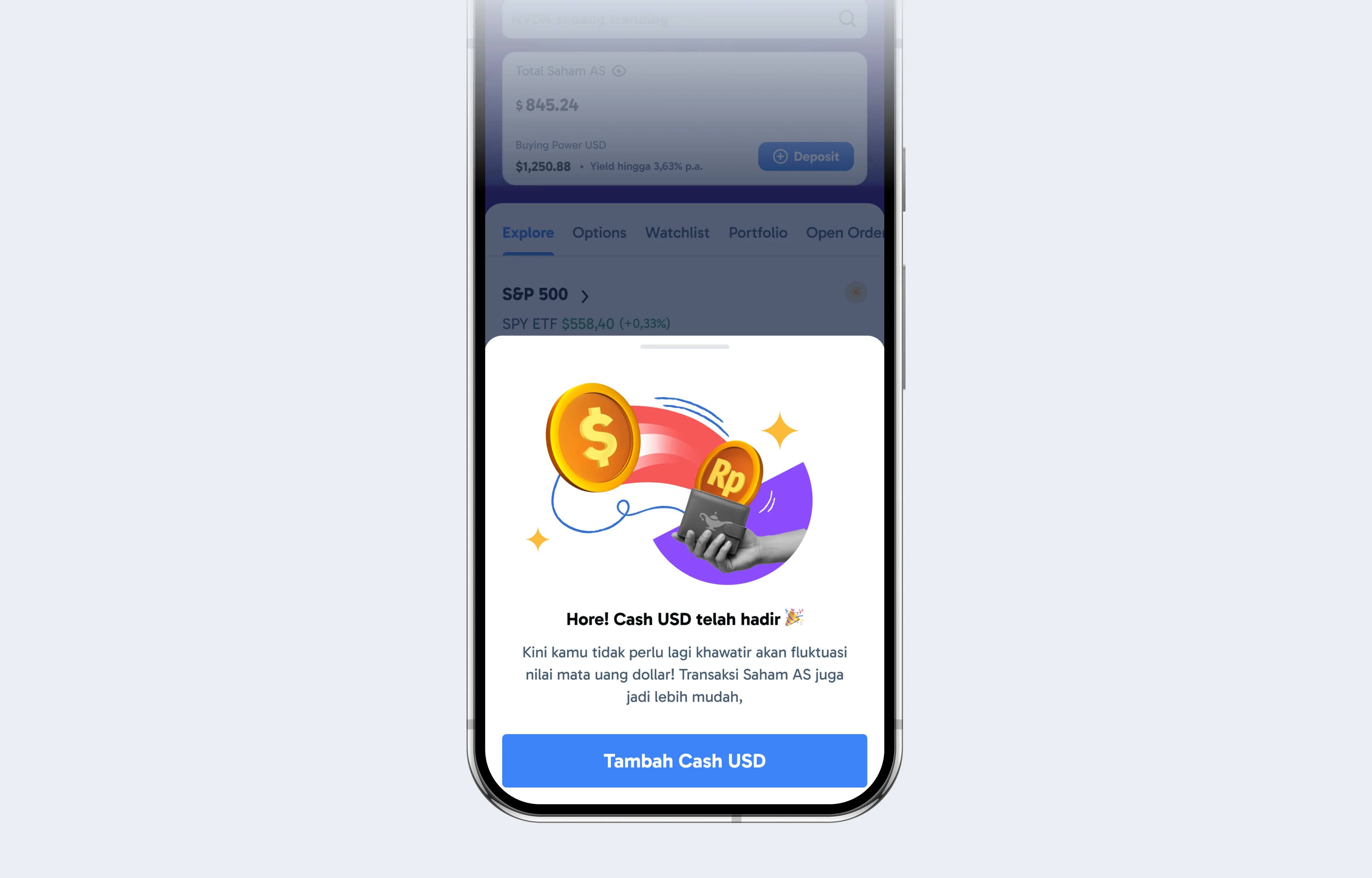
The onboarding wasn’t just explaining functionality. It was reshaping user understanding. We wanted users to internalize a simple mental model:
IDR is the funding source
USD is the trading currency
This distinction became foundational throughout the experience and was reinforced through labels, hierarchy, and microcopy across the interface. Financial confusion often happens when systems behave differently across screens. By reinforcing the same currency logic repeatedly, users gradually built confidence in how the system worked.
Designing clarity through progressive disclosure
One of the biggest UX challenges in financial products is balancing transparency with cognitive overload. Users need access to important information, but too much detail upfront can make interfaces feel intimidating. To solve this, we used progressive disclosure throughout the experience.
The interface prioritized only the most actionable information first, while secondary details such as:
FX rates,
converted values,
fees,
and calculation breakdowns
were revealed contextually when needed. This allowed advanced users to explore deeper financial information without overwhelming newer traders. Instead of forcing everyone into the same level of complexity, the experience adapts to user intent.
Making money more visible
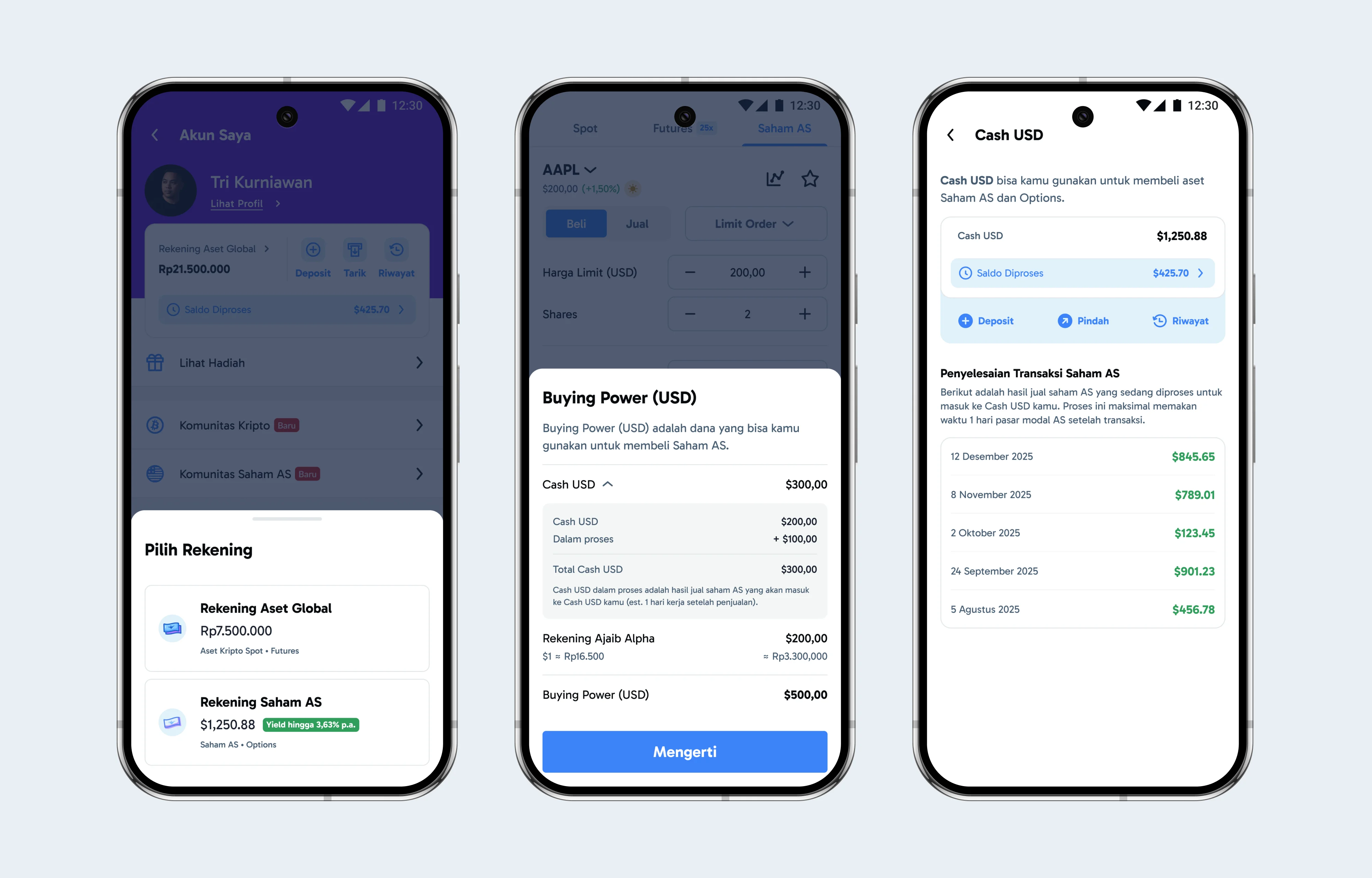
We also redesigned how balances and cash positions were presented throughout the product. Users could now clearly distinguish:
USD Wallet balance
IDR equivalent value
settled funds
unsettled funds
This visibility was especially important because money that exists in a system but feels unclear often creates anxiety. The redesign focused on helping users answer simple but emotionally important questions instantly:
“How much money do I really have?”
“What can I use right now?”
“What’s still processing?”
“Why did this number change?”
Clear financial visibility creates confidence, and confidence increases action.
Defining success beyond UI metrics
This project also reinforced the importance of aligning design decisions with measurable business outcomes. I worked closely with the Product Manager to define success metrics tied directly to the intended behavioral changes.
The team focused on metrics such as:
Avg. TPV Monthly
Higher TPV per active user
Trading Frequency
Increased monthly trading frequency
% Retention
Improved retention in US Stocks
NPS Score
Better US Stocks NPS scores
What mattered wasn’t simply whether users liked the new wallet. The real success metric was whether users traded with more confidence and consistency afterward.
The Outcome
The redesigned experience fundamentally changed how users interacted with US Stocks on Ajaib. Before the redesign, the experience was defined by:
Hidden FX costs,
Repeated forced conversions,
Unclear balances,
And hesitation before trading.
After introducing USD Wallet, the experience became:
Direct USD-based trading,
Transparent buying power,
Clearer cash visibility,
And faster, more confident decision-making.
More importantly, the product stopped feeling like it was working against users financially. And that shift matters deeply in investing products.
What I Learned
This project changed how I think about fintech design. Designing financial products is not just about making flows smoother or interfaces cleaner. It’s about shaping how users think about their money. Every interaction carries emotional weight because every action can impact someone’s finances.
You can’t always remove complexity from financial systems. But you can design clarity around that complexity.

Tri Kurniawan
Product Designer