
Gotrade
Redesigning Investing to Drive Confidence and Engagement
UI/UX, Product Design, Mobile Apps Design
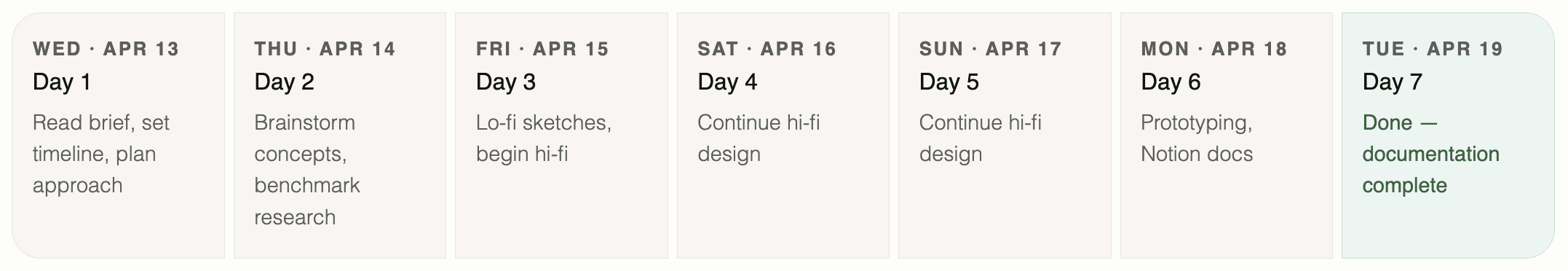
In a 7-day solo design sprint, I reimagined the Gotrade experience to drive confidence and engagement. The goal wasn’t just to improve usability, but to reshape how investing feels, particularly as the product expands into a multi-asset ecosystem.
2022
Product Designer
Figma, Adobe Ilustrator, Adobe Photoshop, Notion, QuickTime
Platforms
Mobile App (iOS & Android)
The challenge & the choice I made
Gotrade gave me 4 tasks and told me to pick 2. I did all 4, and went deeper on each than the brief required. Here's why that was the right call, and what each task was actually asking for.
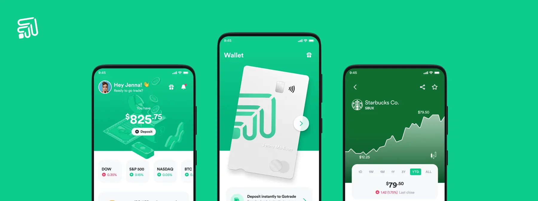
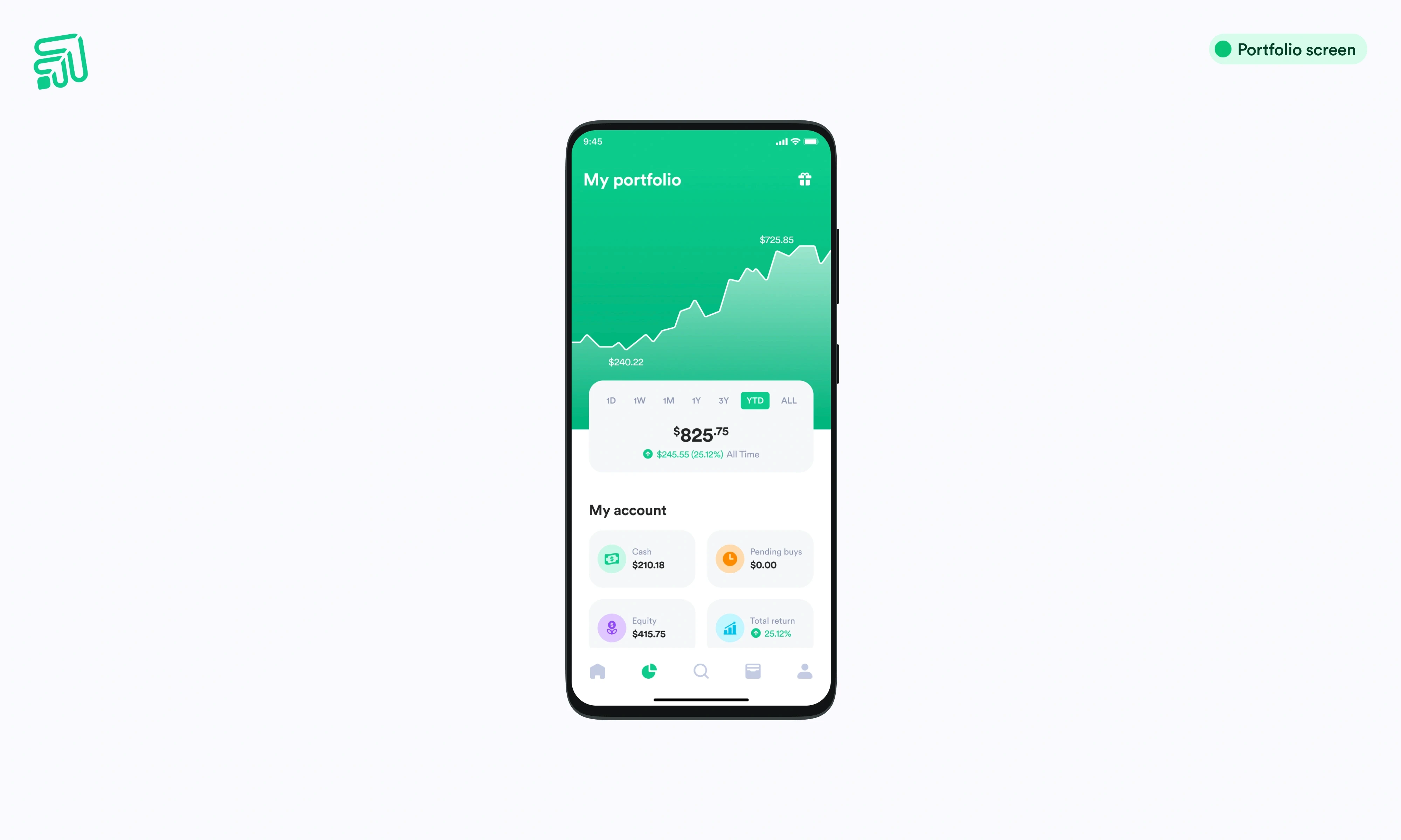
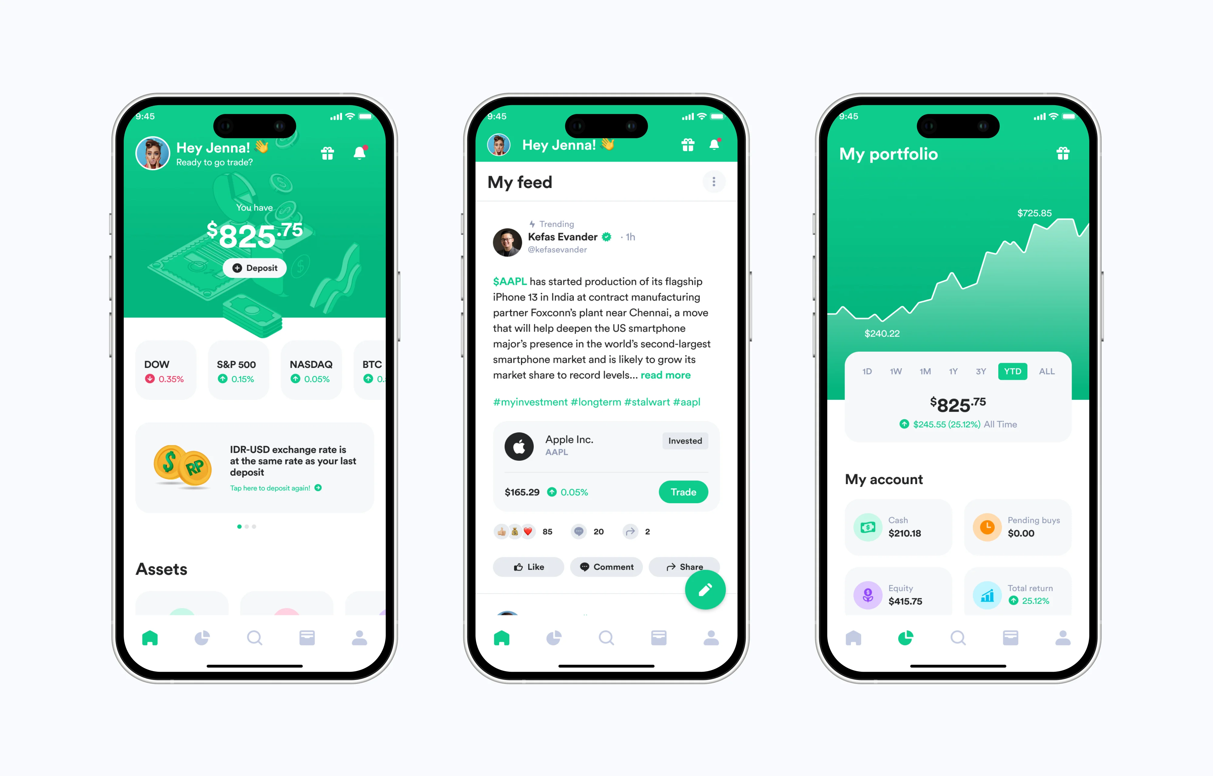
Multi-asset home screen redesign
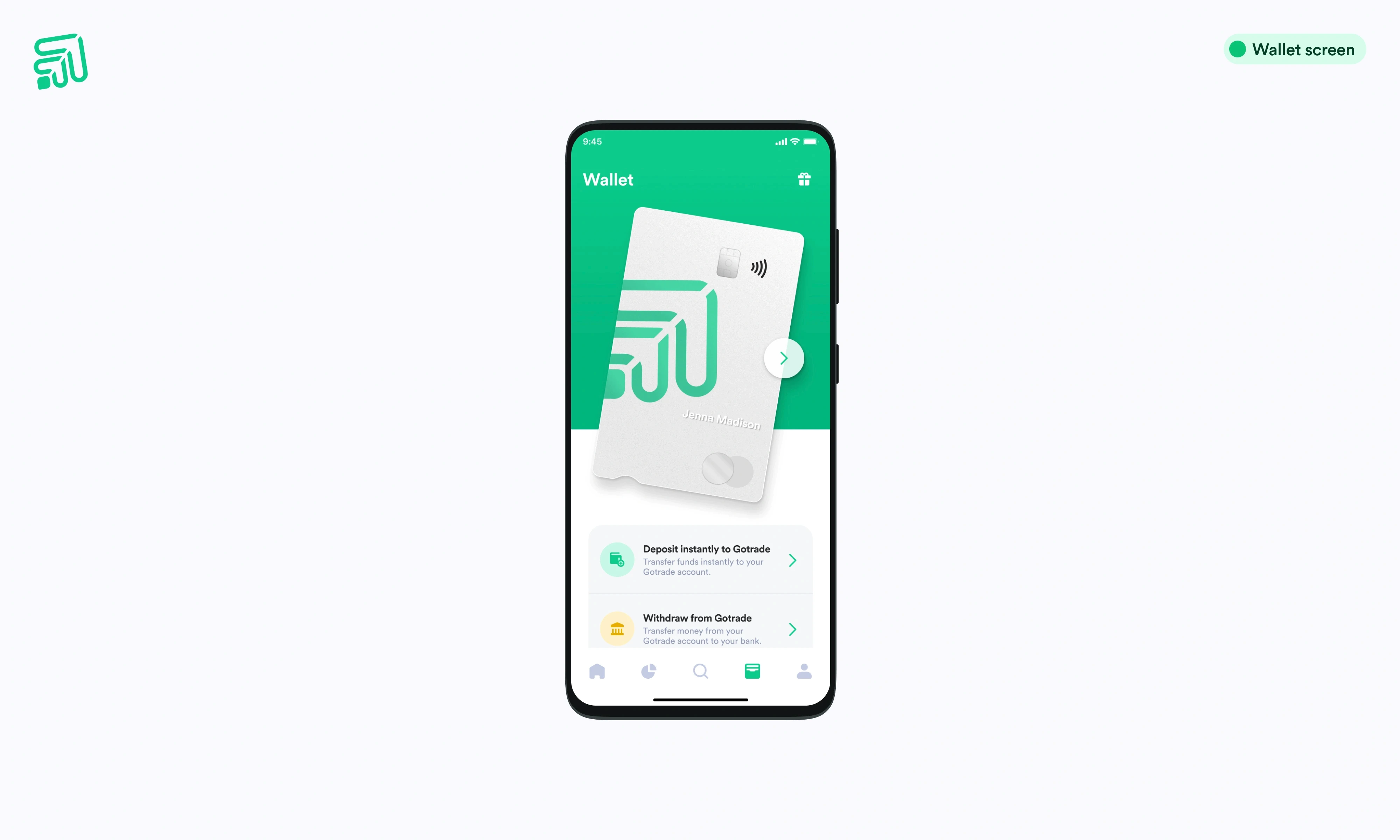
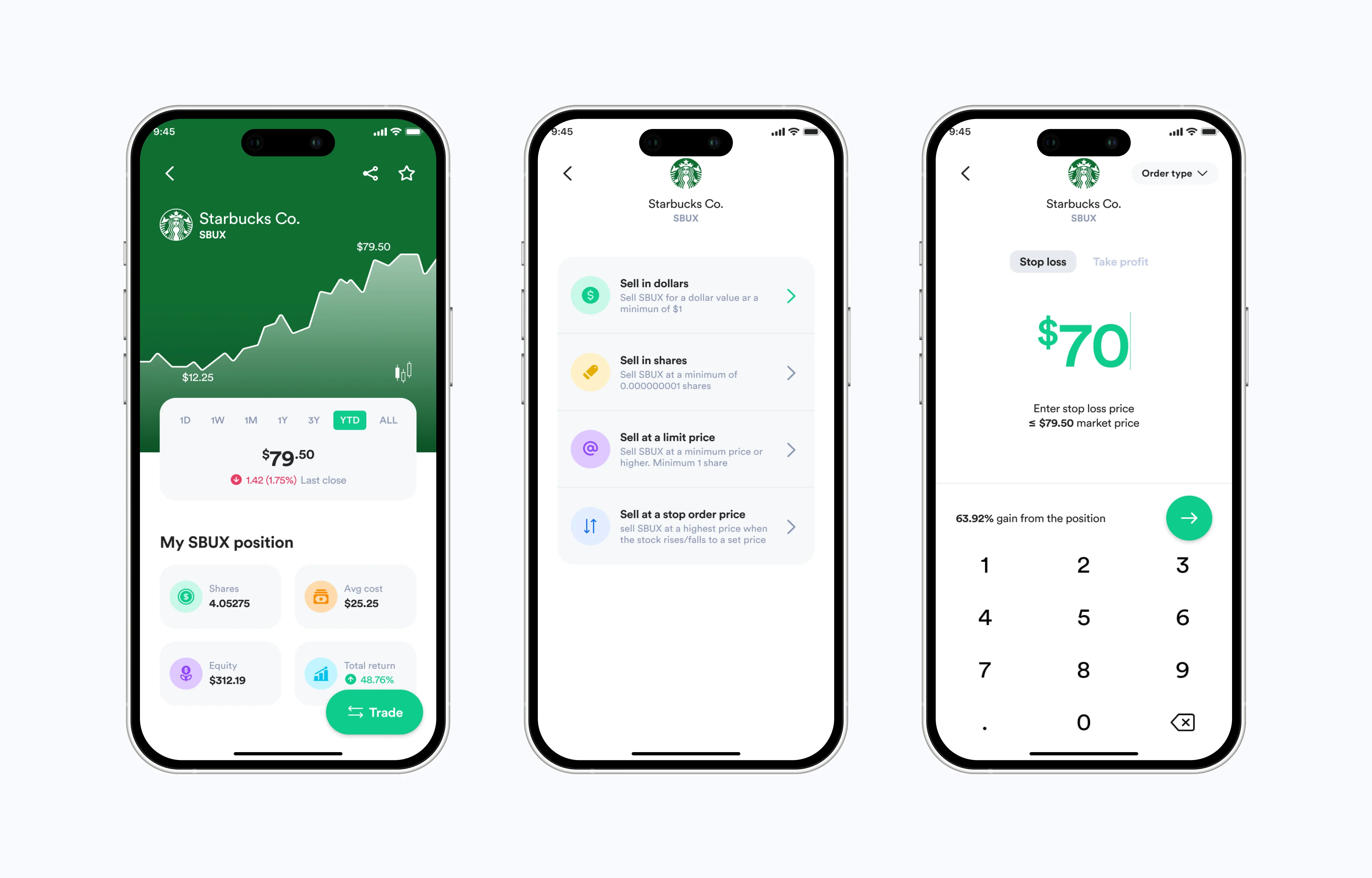
Home needed to evolve from a single-asset balance view into a control center for stocks, ETFs, crypto, gold, bonds, wallet, and a virtual card, without becoming overwhelming.Stop orders (take profit & cut loss)
Design the full stop-order flow, including both entry and exit triggers, giving traders automated protection and profit-locking without adding cognitive load mid-trade.Share trades social feature
Not required, but designed anyway. The community & social layer was the missing piece in the investor journey, a gap that no existing Gotrade feature addressed.Home screen info banners
Contextual, timely messaging (exchange rate alerts, new asset announcements) surfaced above the fold; designed so they inform without polluting the core experience.
The Timeline
Rethinking the starting point of investing
Most investment platforms are built around execution.
Buy. Sell. Track.
But investing doesn’t actually begin with any of those actions. It begins with something far less tangible, yet far more critical: confidence.
Through analysis of Gotrade’s existing experience, I identified a fundamental gap. While users technically had everything they needed to trade, they lacked the psychological support required to decide to trade in the first place.
This gap was especially evident among new investors. They could browse stocks, view charts, and execute trades, but they hesitated. They second-guessed decisions. Many dropped off after their first interaction.
The issue wasn’t functionality. It was conviction.
The conviction gap in the investing
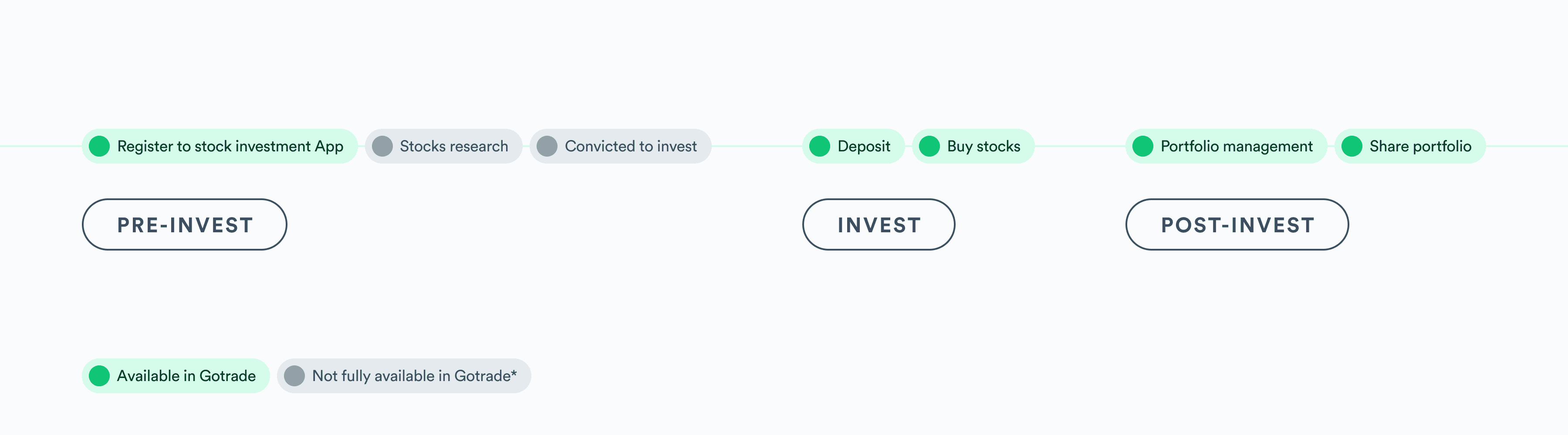
To better understand this, I mapped the full investor journey, from pre-investment to post-investment behavior.
Pre-invest: Research, learning, building conviction.
Invest: Depositing funds, executing trades.
Post-invest: Managing portfolio, reflecting, sharing insights.
Gotrade performed well in the execution layer, but left users unsupported in the decision-making layer—particularly in the pre-invest phase. This is what I define as the conviction gap. Users didn’t just need tools. They needed signals. They needed reassurance that their decisions made sense, context from other investors, and a way to validate their thinking before taking action.
Without this layer:
Confidence remains low.
Engagement drops.
Investing feels transactional instead of meaningful.
Design opportunity: from trading tool to decision platform
Rather than simply improving existing features, I reframed the challenge:
How might we design Gotrade to increase user confidence and engagement—not just enable transactions?
This shift led to a broader vision:
Transform Gotrade from a trading interface into a decision-making ecosystem.
Support users across the entire investor journey.
Introduce behavioral design elements that encourage action.
From this perspective, three core opportunities emerged:
Social investing as a source of confidence.
Multi-asset clarity without overwhelming complexity.
Guided decision-making through smart tools and feedback.
A behavioral system, not just features
Instead of designing isolated improvements, I approached this as a system-level redesign, where each component reinforces user confidence and encourages engagement.
1. Turning the home screen into a decision hub
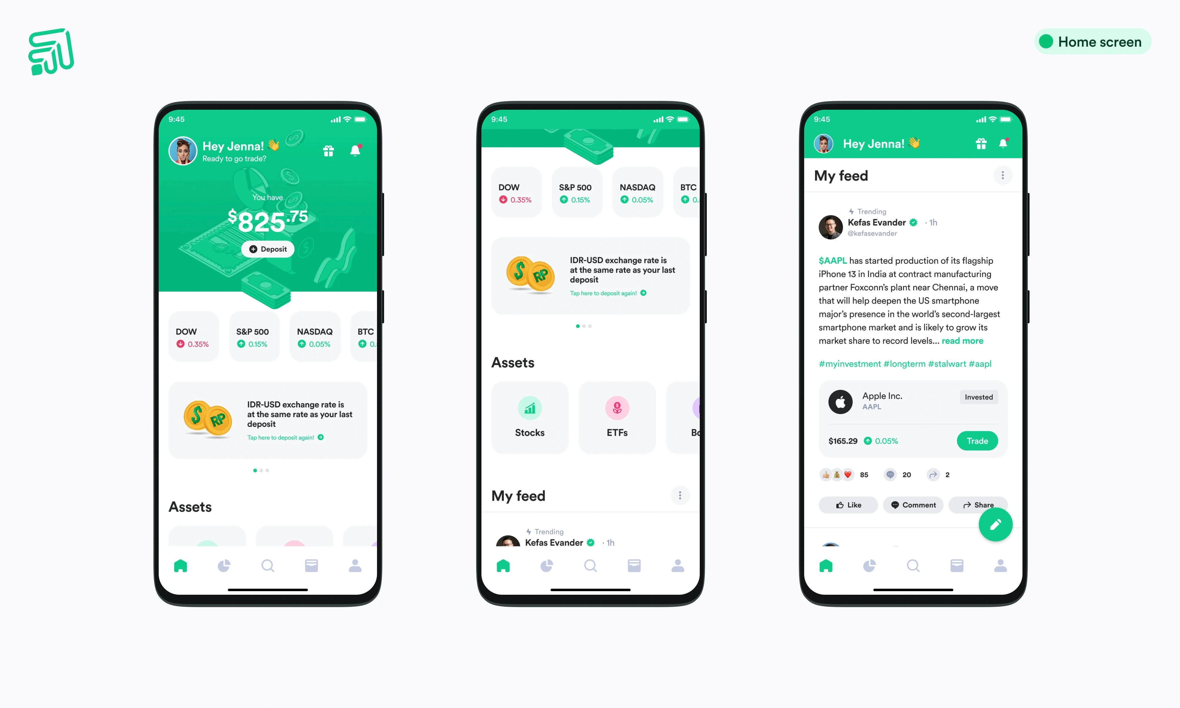
The home screen evolved from a static balance display into a dynamic control center.
It now integrates:
Portfolio overview.
Market signals.
Multi-asset access.
Community insights.
This allows users to move seamlessly through a natural decision flow:
See → Understand → Act
A key design decision here was introducing horizontal scrolling for multi-assets, preserving vertical space for the social feed—the core engagement engine. The result is a home experience that prioritizes clarity while enabling depth.
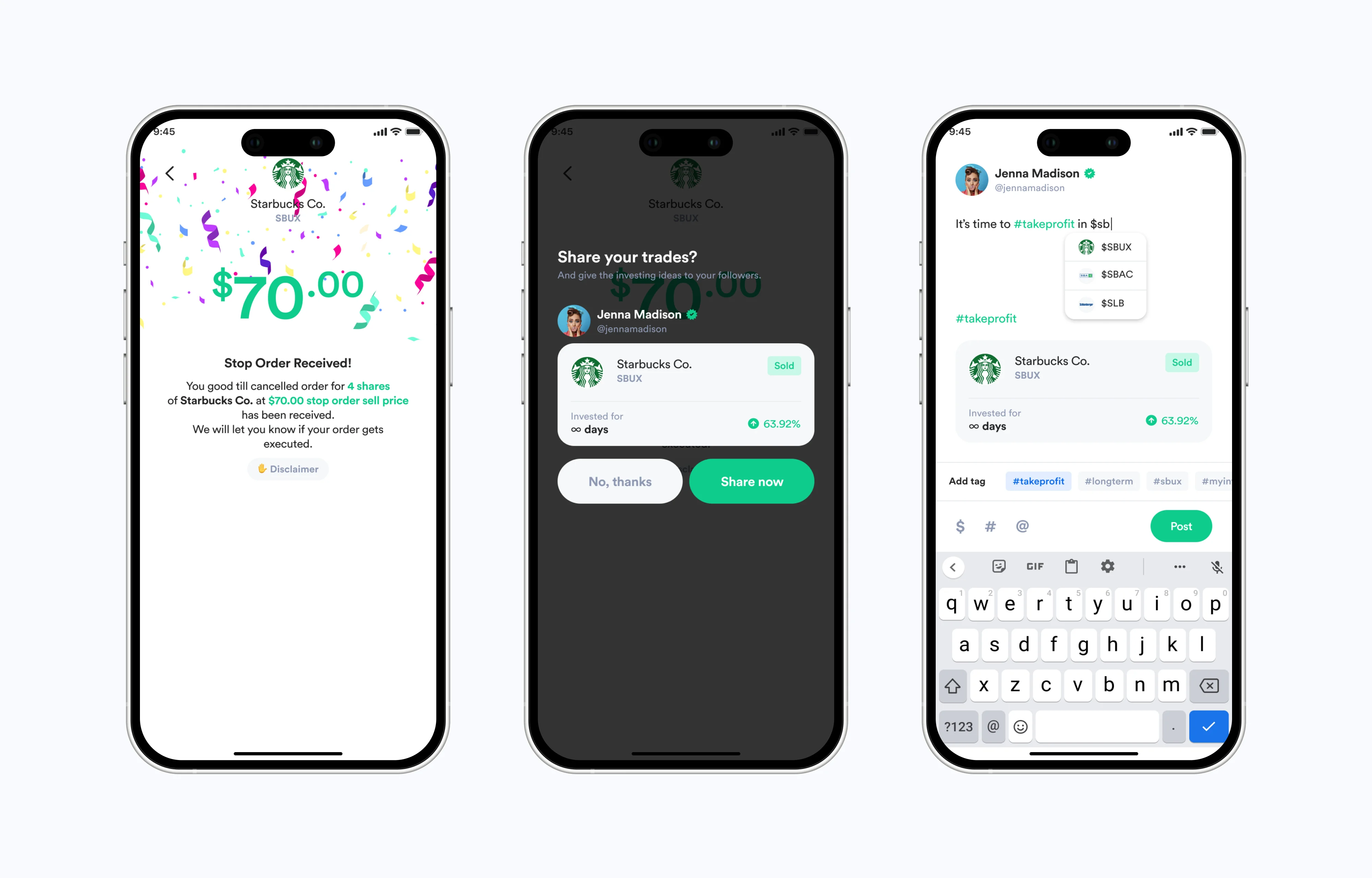
2. Introducing social investing as the missing layer
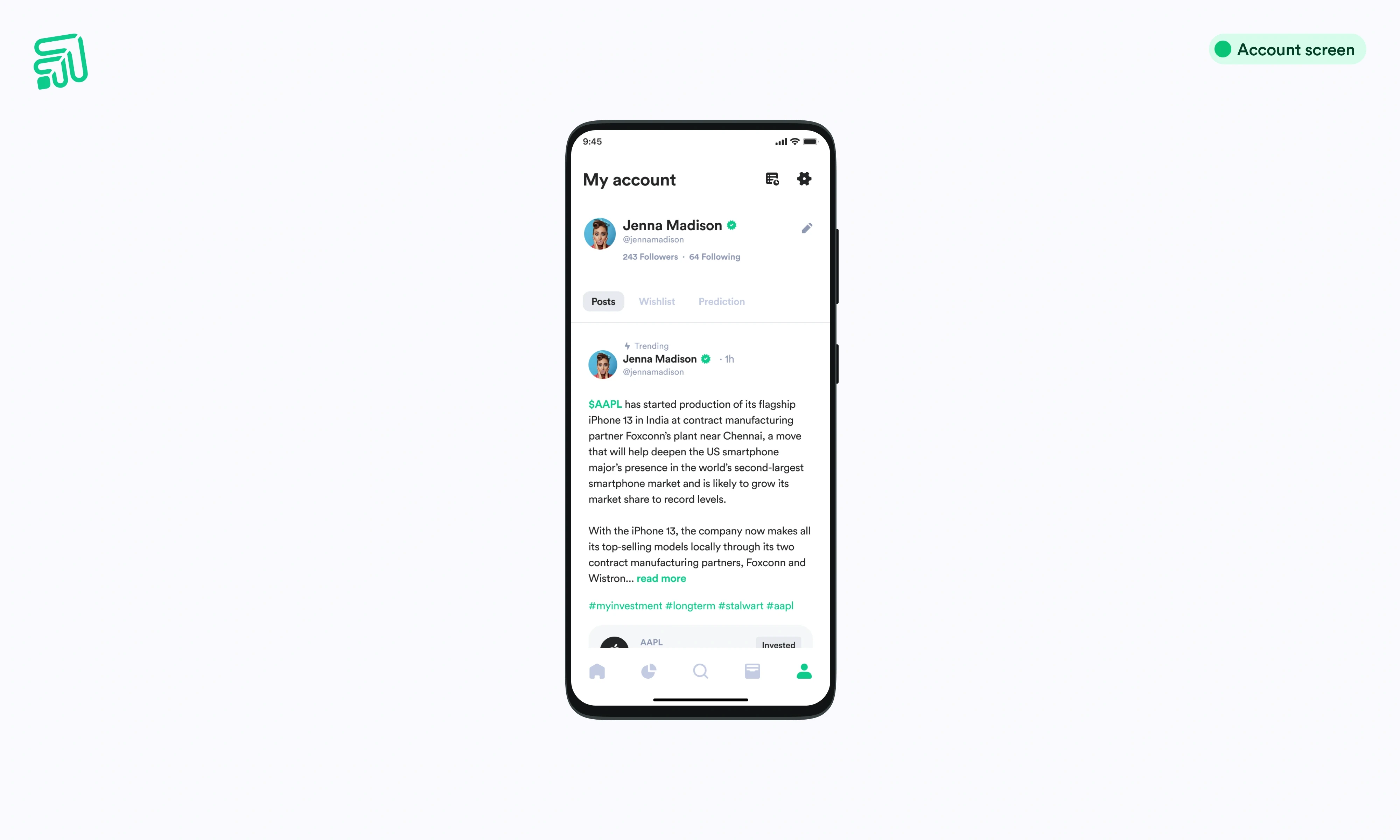
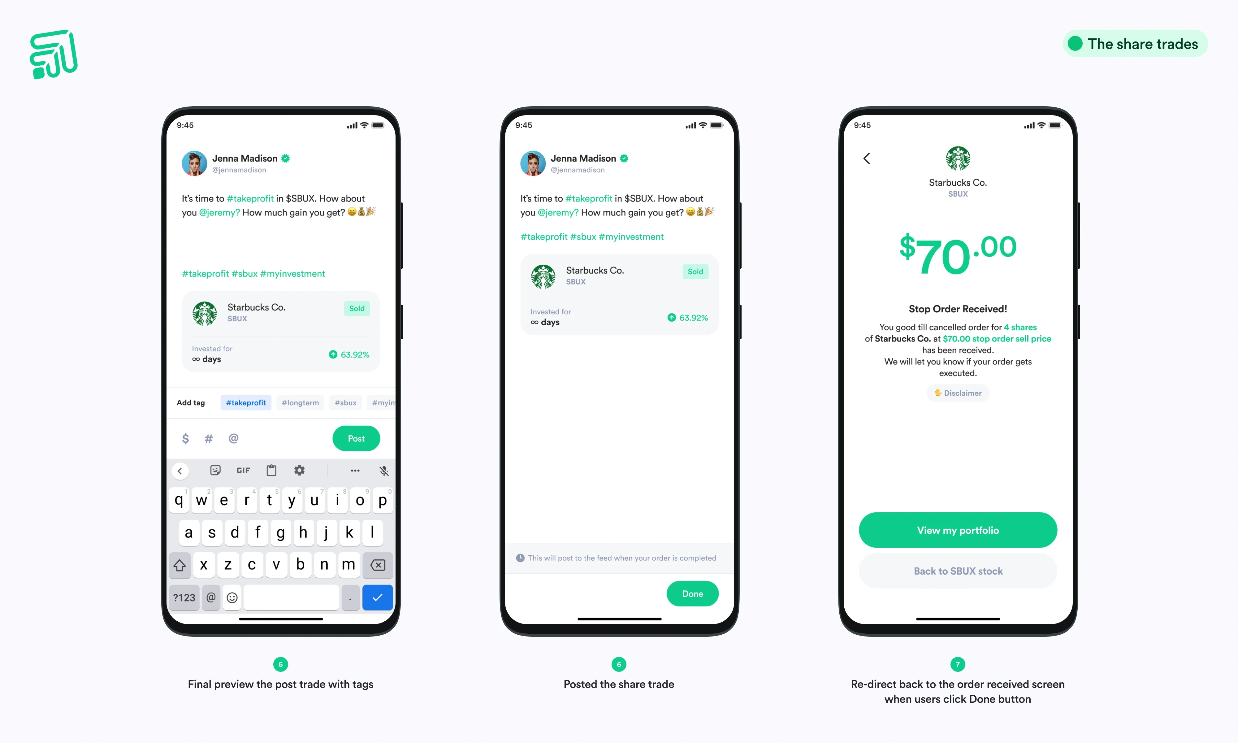
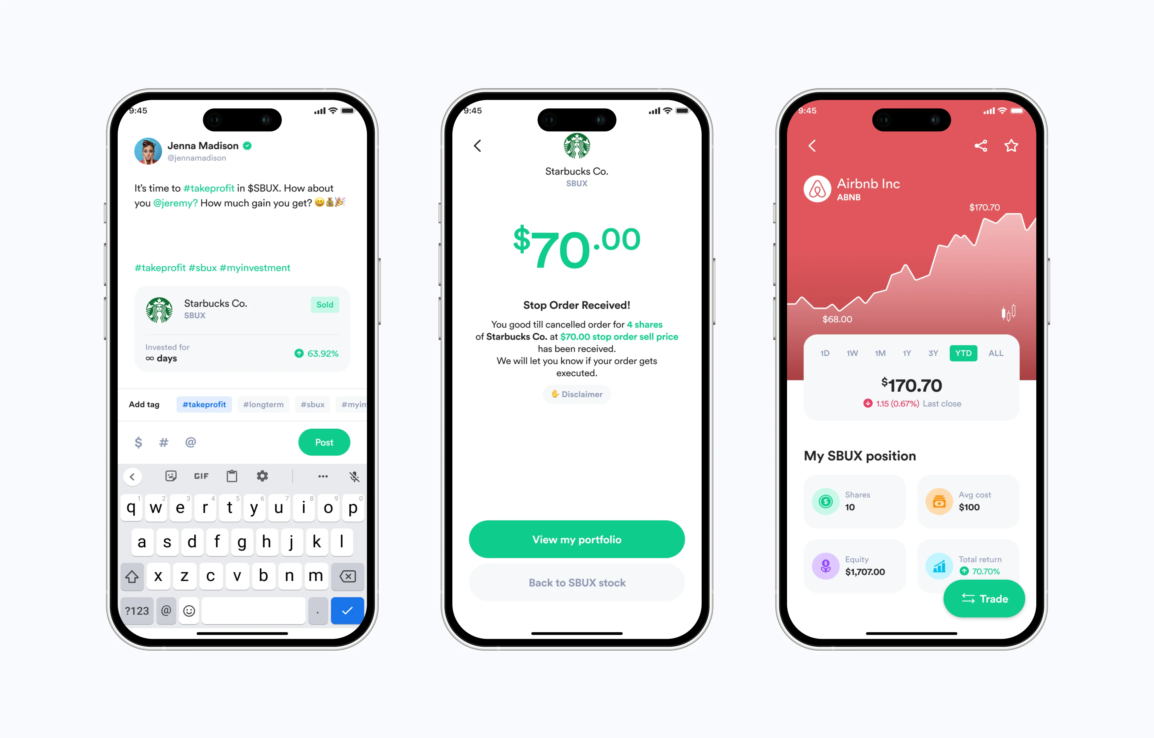
One of the most impactful additions was a social investing layer; a feature not originally required in the brief, but critical to solving the conviction gap.
Users can:
Share trades.
Explain their reasoning.
Learn from others’ decisions.
This transforms the platform from a tool into a community-driven ecosystem.
Importantly, the feature is designed to be opt-in, not intrusive. The share prompt appears right after a trade is completed, when user emotion and conviction are at their peak. This timing turns sharing from a generic action into a meaningful expression.
Beyond engagement, this also opens sustainable monetization opportunities:
Tipping for valuable insights.
Premium subscriptions for expert investors.
3. Designing for emotional safety with stop orders
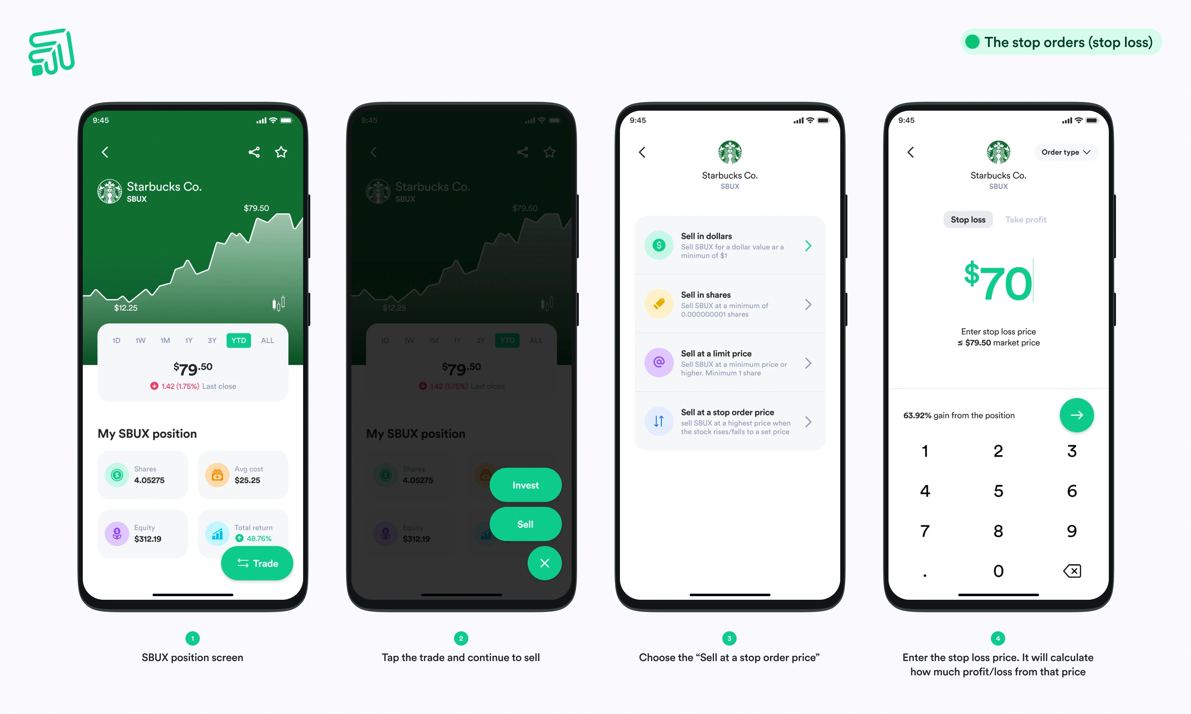
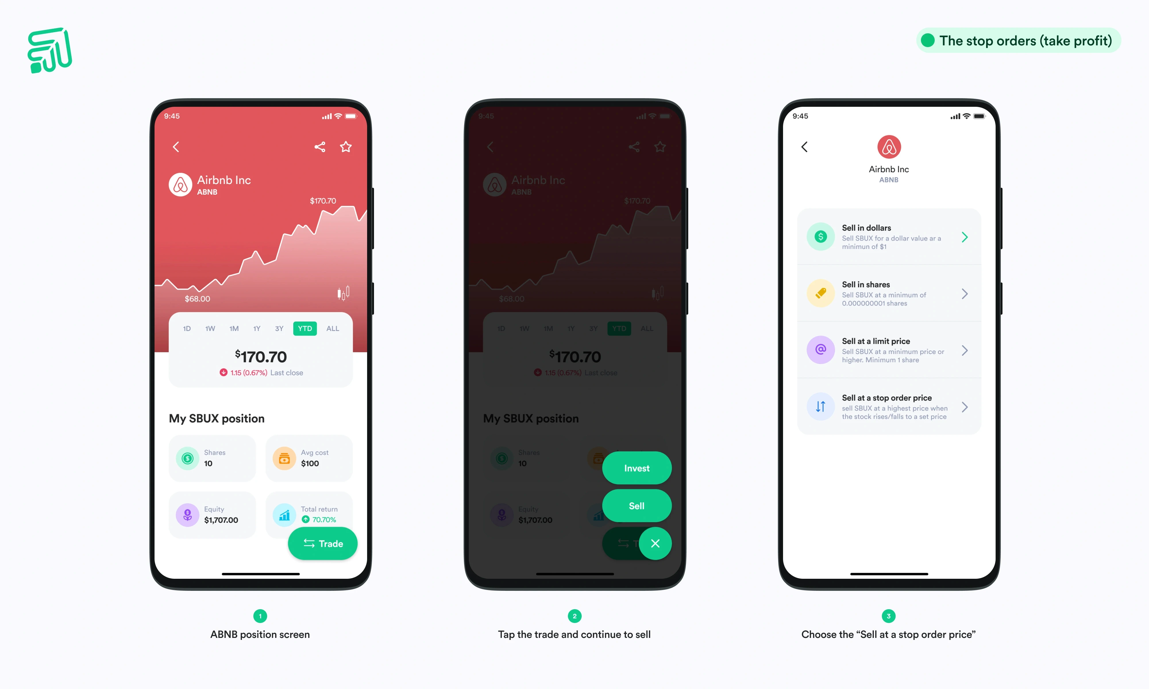
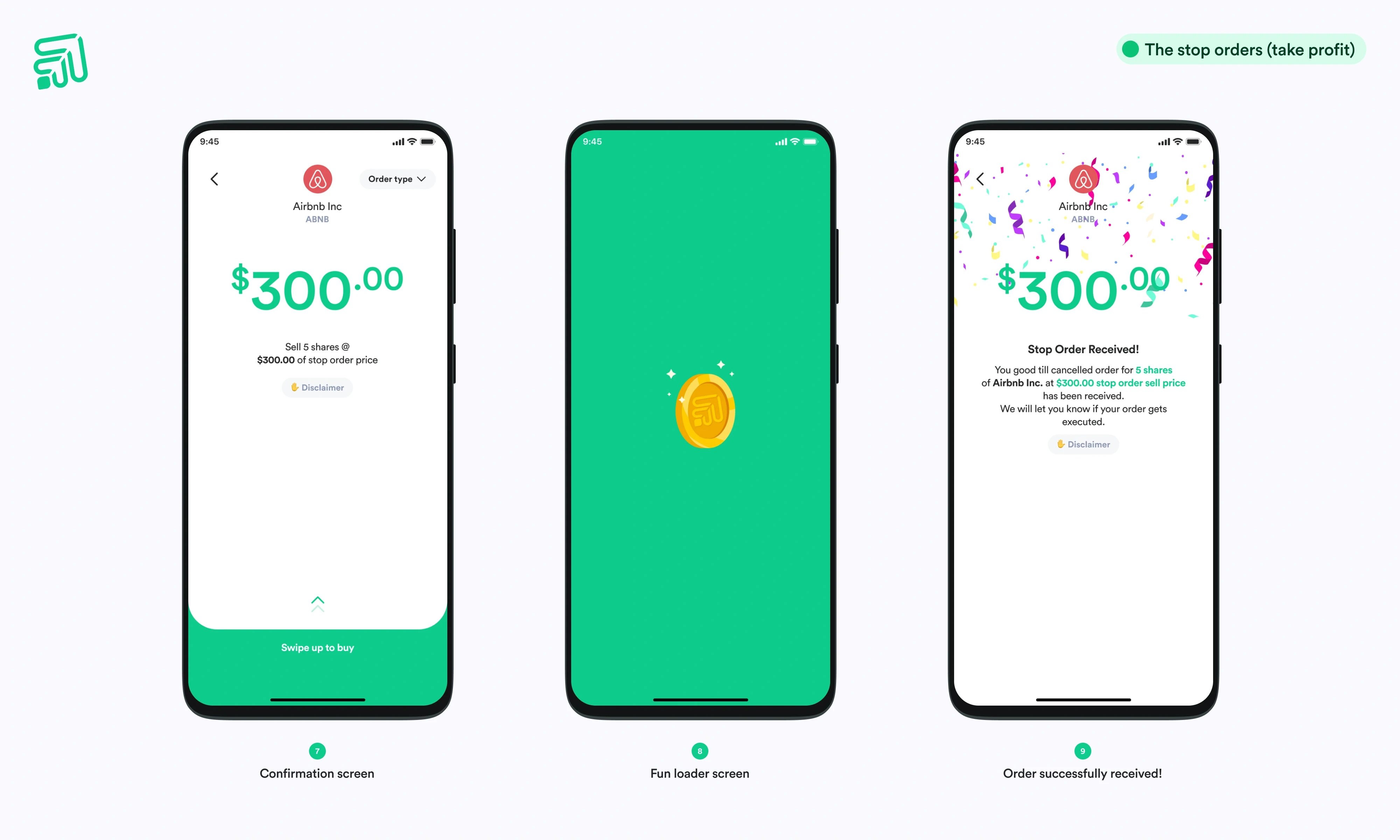
Investing is inherently emotional. Fear of loss and regret often prevent users from acting. To address this, I introduced Stop Loss and Take Profit features; designed not just as tools, but as confidence enablers.
Key design principles included:
Guided inputs with clear constraints.
Live profit/loss previews.
Simple mental models for beginners.
One particularly intentional decision was capping stop loss values at the current market price. This prevents common beginner mistakes and uses constraint as a form of education—teaching through interaction rather than explanation.
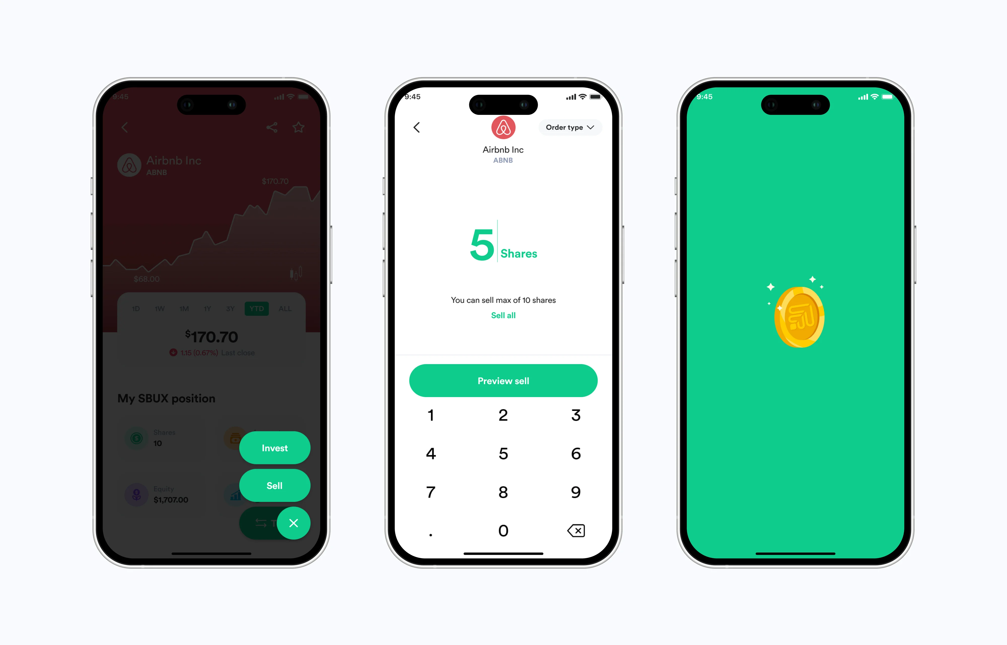
4. Simplifying multi-asset expansion
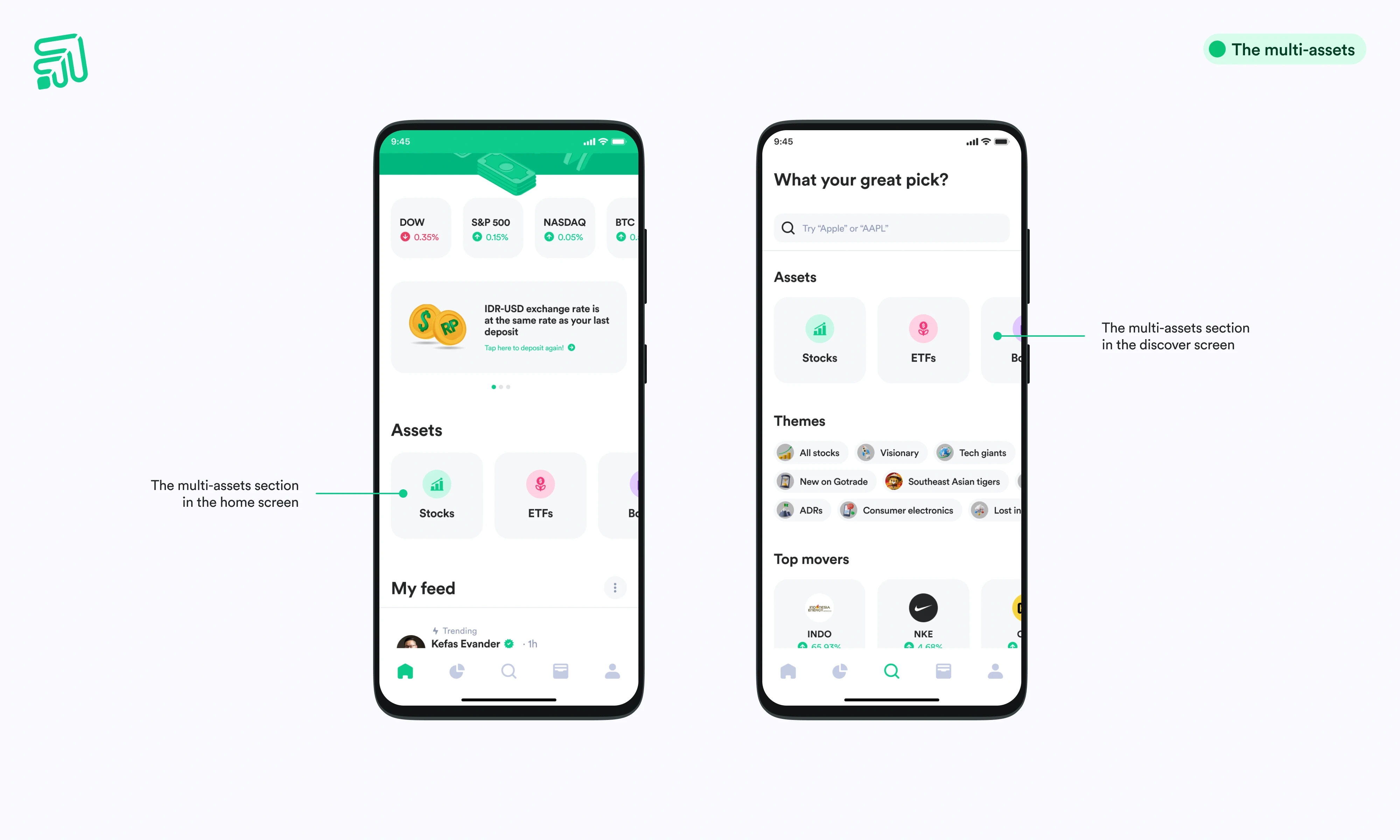
As Gotrade expands beyond stocks into ETFs, crypto, and other assets, the risk of complexity increases. The challenge was to introduce multi-asset functionality without overwhelming users.
The solution:
Clear categorization of asset types.
Seamless switching between assets.
A unified financial view within a single interface.
Inspired by platforms like Revolut, this approach ensures users gain more capability without cognitive overload.
5. Driving action through contextual messaging
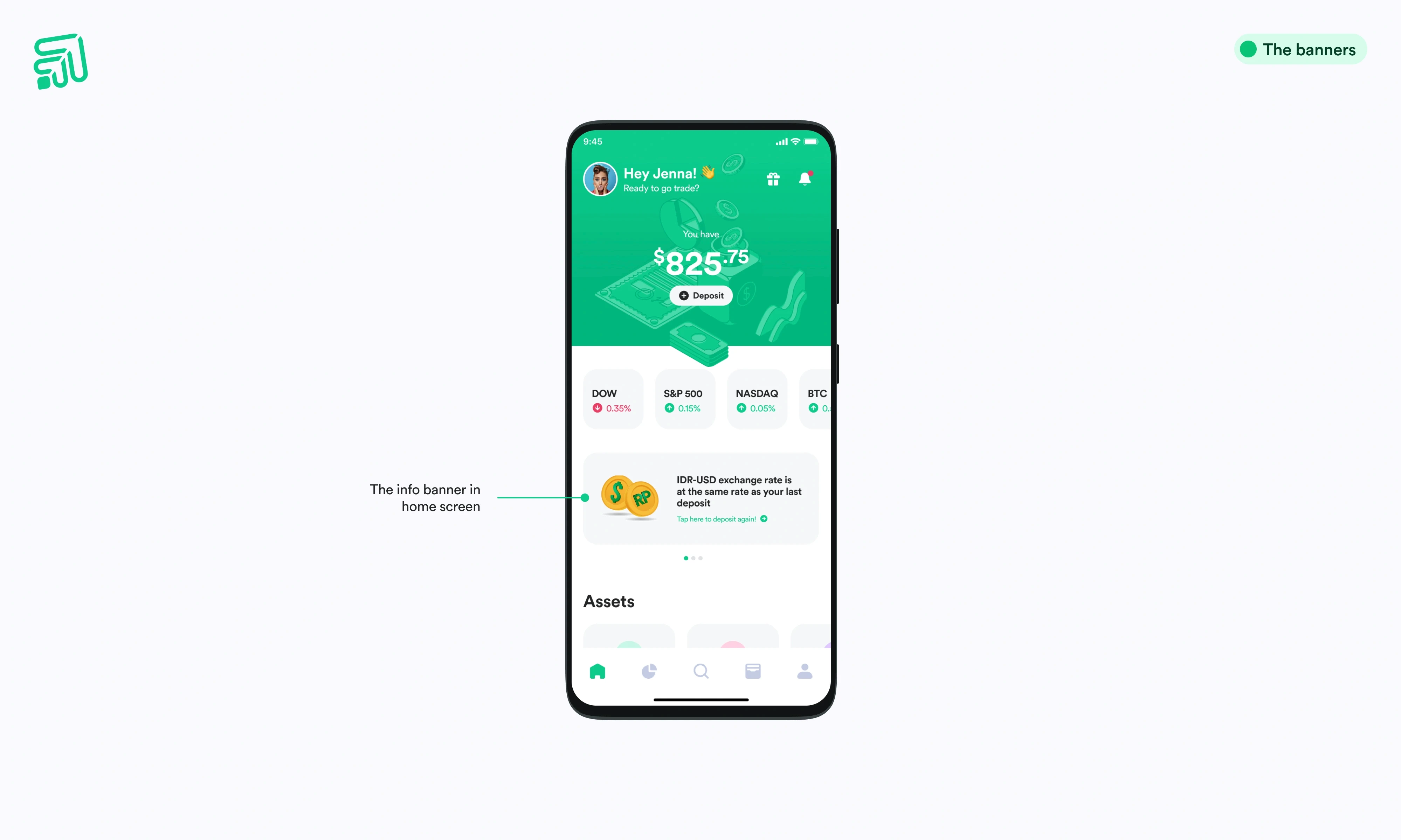
Another key insight: users often don’t know when to act.
To address this, I introduced contextual information banners, strategically placed within the home screen.
These include:
Market updates.
Exchange rate alerts.
New asset announcements.
Positioned just below market data, these banners provide timely nudges without disrupting core functionality. This creates a subtle but effective layer of behavioral guidance.
From Transactional to Decision-Driven Experience
The redesigned experience fundamentally shifts how Gotrade operates.
Before:
Focused on execution.
Limited engagement.
Minimal support for decision-making.
After:
Built around user confidence.
Enhanced with social and learning layers.
Designed to encourage ongoing participation.
The platform evolves from a passive tool into an active partner in the user’s investing journey.
Expected Impact
While this was a concept sprint, the expected outcomes are clear:
Increased trading activity driven by higher confidence.
Stronger retention through continuous engagement.
More meaningful user behavior through community interaction.
A scalable foundation for future product growth
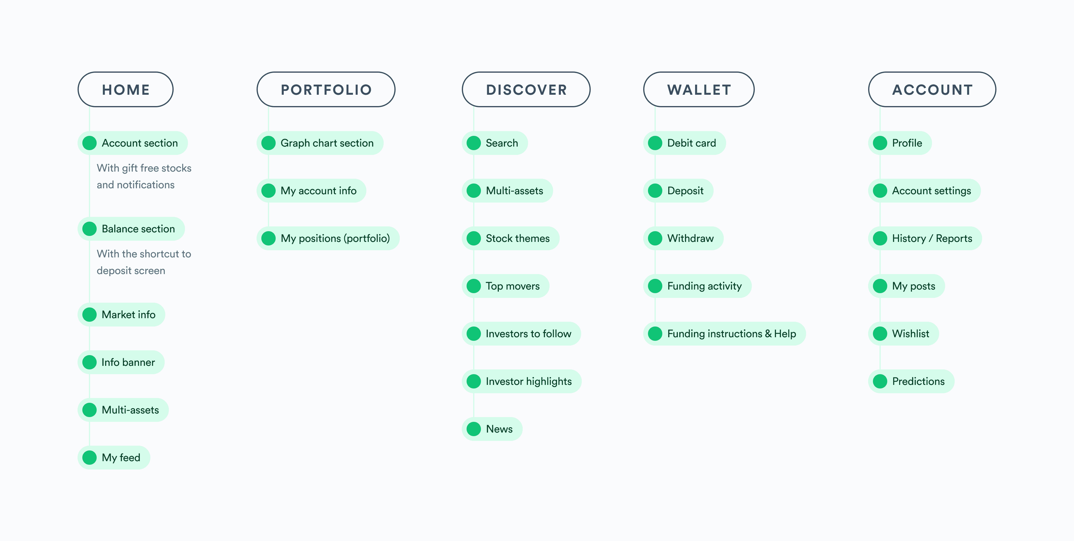
Other screens updated:
Key learnings
This project reinforced a critical perspective on designing for fintech:
Benchmark before you sketch. Day 2 was entirely benchmarking — Robinhood, Public, Freetrade, Revolut, Stockbit. That research directly shaped the stop order UX pattern, the social feed structure, and the wallet screen architecture. Without it, I'd have been designing from assumption.
Constraint as communication. Capping the stop loss input at market price teaches users what a stop loss is without any copy. The interaction itself explains the rule. This is better than a tooltip or help text that most users skip.
Social features need emotional hooks, not just UI. The share trade prompt is triggered at the exact moment a user's emotion is highest — just after a trade confirms. That timing transforms a generic "share" CTA into something that feels personally meaningful and worth tapping.
A 7-day solo sprint demands ruthless prioritization. The timeline required deciding early what "done" means for each screen. I produced concept-level hi-fi for all 4 tasks rather than exhaustive flows for 2. For a test case, breadth of thinking mattered more than depth of edge-case coverage.
Trading is easy. Conviction is the hard part. Design for conviction, and users don’t just invest; they stay invested

Tri Kurniawan
Product Designer