
Haven
A Home Screen that Knows What Matters Most
UI/UX, Product Design, Mobile Apps Design
Redesigning Haven's home screen from a feature list into a prioritized control center without a single element fighting for attention.
2024
Product Designer
Figma, Adobe Ilustrator, Adobe Photoshop
Platforms
Mobile App (iOS & Android)
What Haven actually is
Haven is not a typical crypto wallet. It serves two distinct audiences simultaneously: individuals who want to store, send, receive, and trade multiple cryptocurrencies, and businesses that need to accept crypto payments with lower fees, near-instant settlements, and global reach.
That dual audience, personal portfolio management, and business payments, is exactly what made the home screen problem interesting. One screen had to serve two very different mental models.
The challenge was not adding features. Haven already had them. The challenge was building a hierarchy that lets users reach what they need most without thinking, while keeping the full depth of the product accessible when they need it.
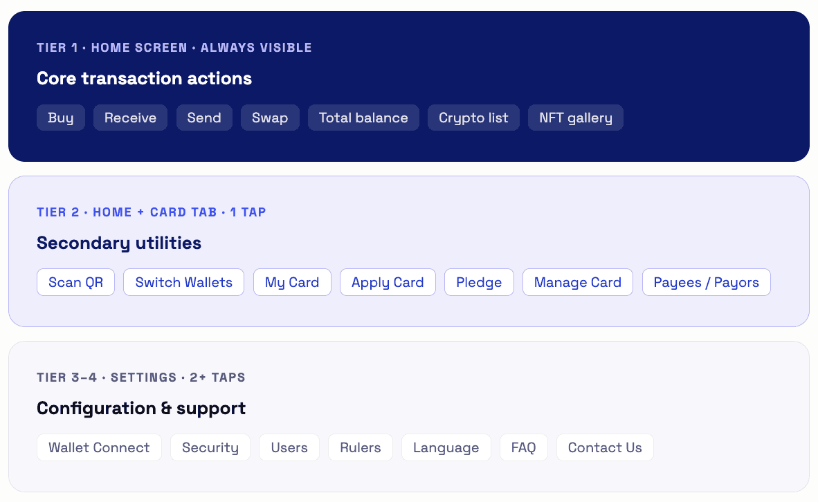
The framework before any pixels
Before opening Figma, I mapped every Haven feature into a 4-level priority pyramid, ordered by frequency of use and urgency. This became the design contract that the home screen had to honor.
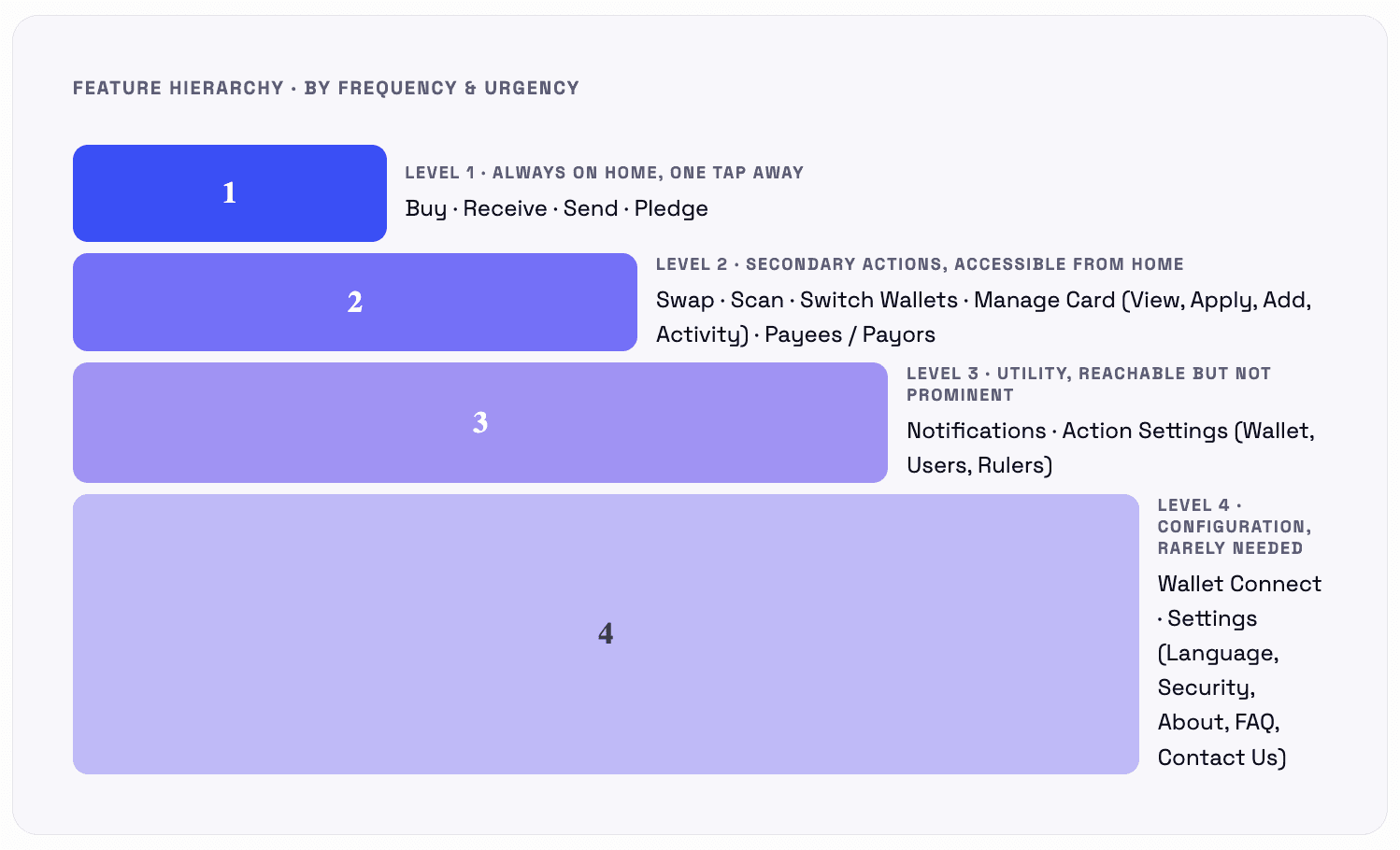
This pyramid wasn't decoration; it became a strict filter. Any layout that buried Level 1 actions or elevated Level 4 settings failed the test, regardless of how good it looked.
The new information architecture
The new IA organizes Haven around 4 top-level navigation destinations; each owns a clear domain. This reduced cognitive switching between financial utilities, asset management, card control, and configuration.
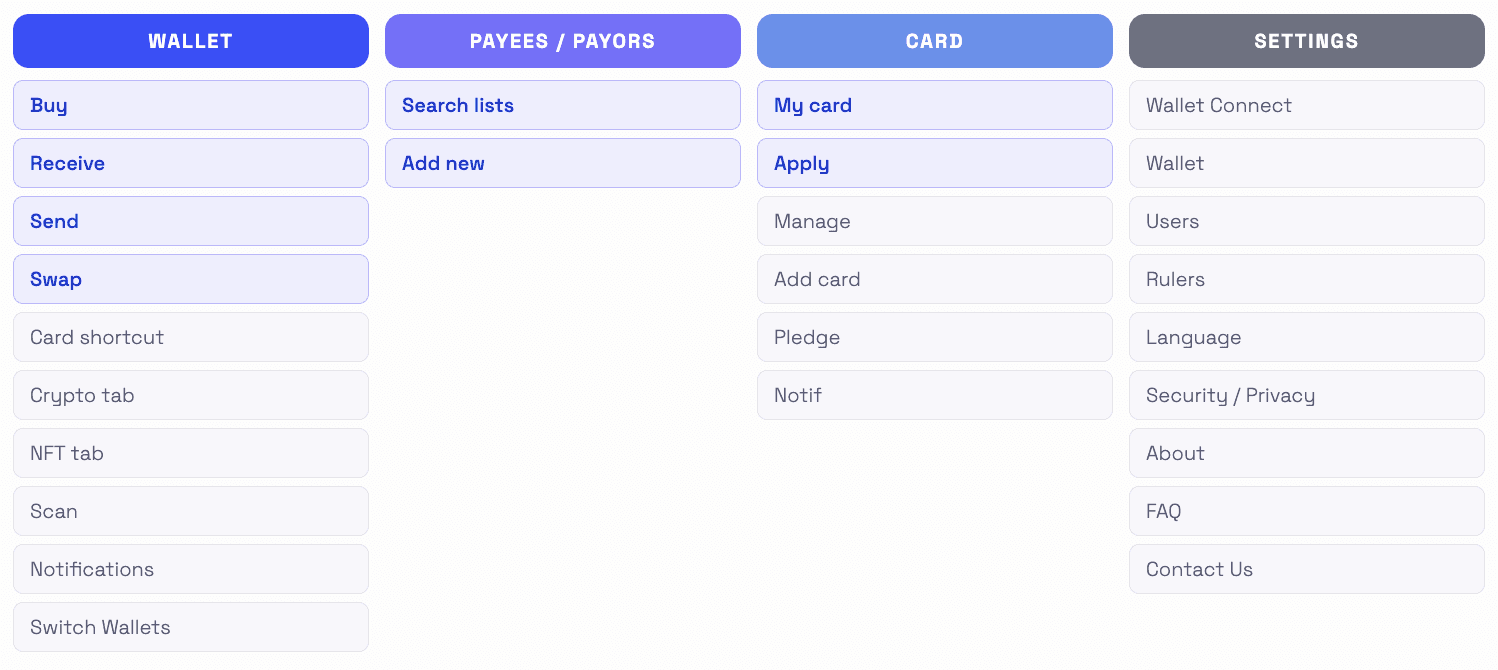
Blue items = Level 1 or Level 2 priority features surfaced prominently. Gray items = Level 3–4, accessible but not competing for attention on the home screen.
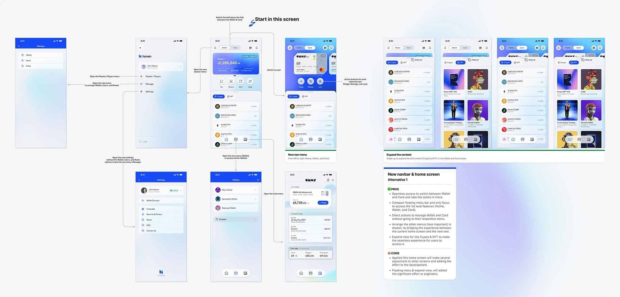
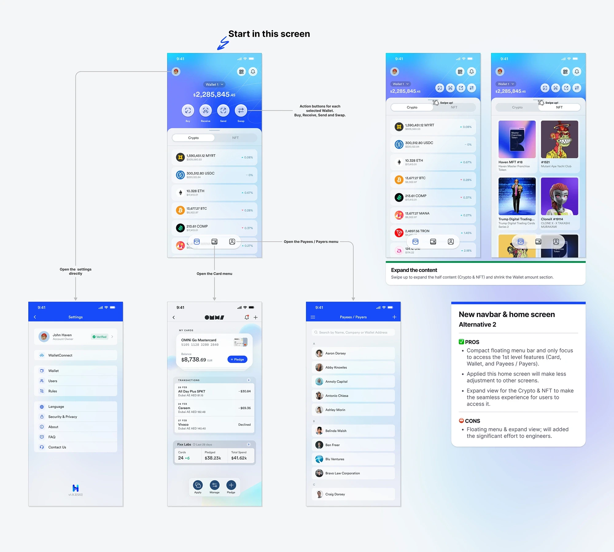
Two alternatives; same goals, different bets
Rather than designing one solution and calling it done, I produced two distinct home screen directions. Each made a different architectural bet on how users move through the app.
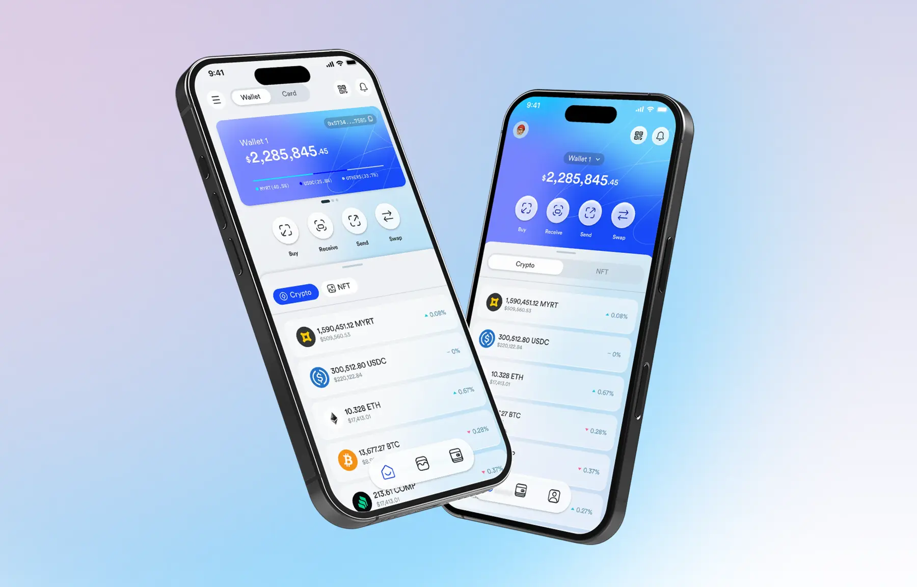
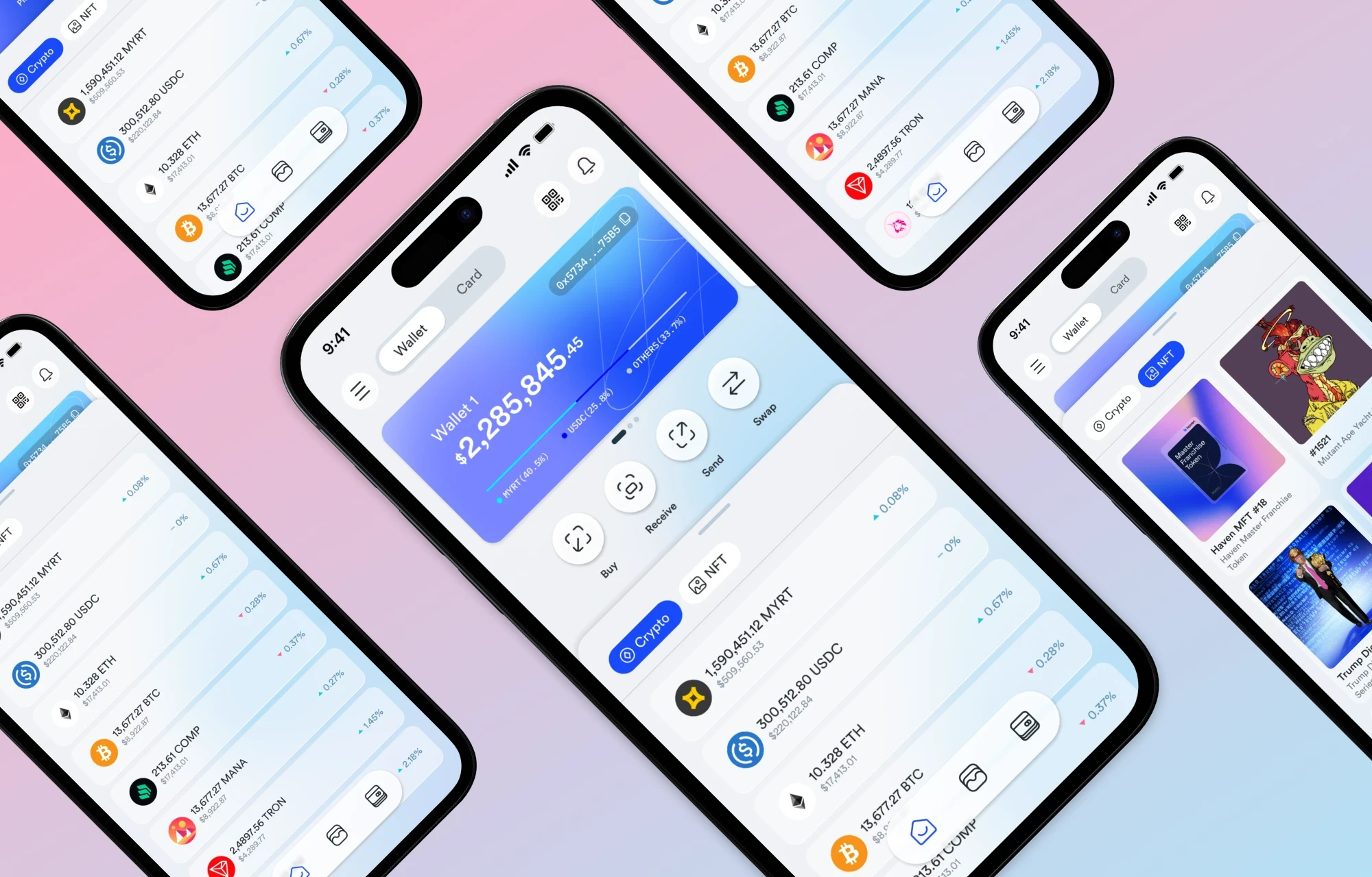
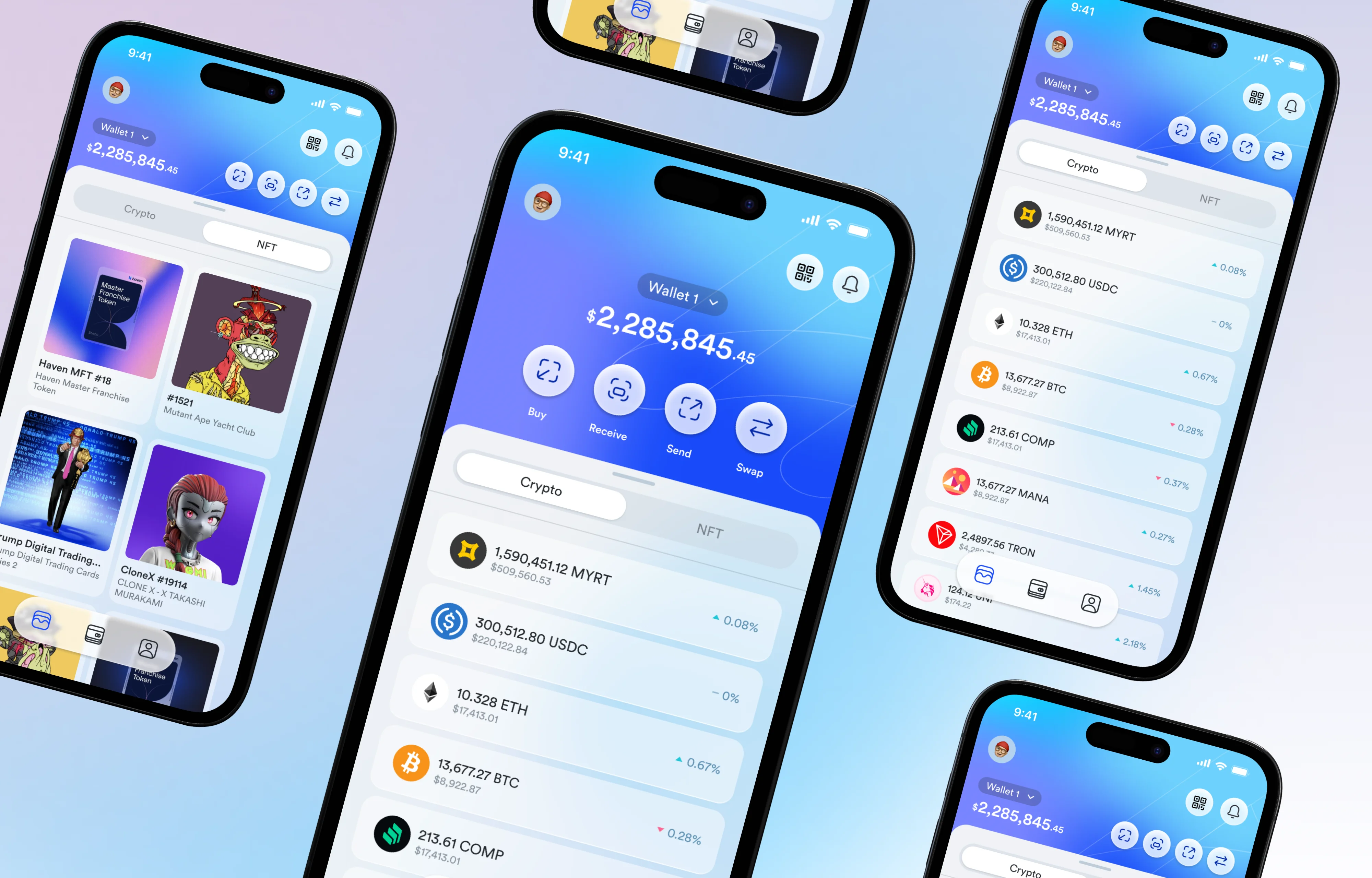
Alternative 1 • selected direction
Tab-within-home: Wallet + Card top nav with Crypto / NFT inner tabs
Familiar nav pattern; top tab bar with Wallet and Card is a convention users already know from banking apps.
Crypto / NFT inner tabs let users switch asset views without leaving the home context; no modal, no deep navigation.
Action row (Buy, Receive, Send, Swap) stays persistently visible regardless of which tab is active; Level 1 features are always one tap away.
NFT grid view and Crypto list compete for layout space, requires careful scroll choreography.
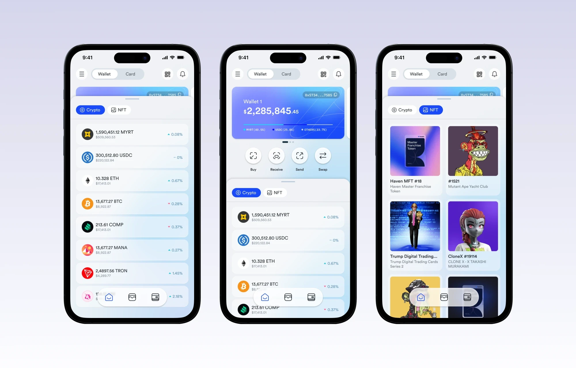
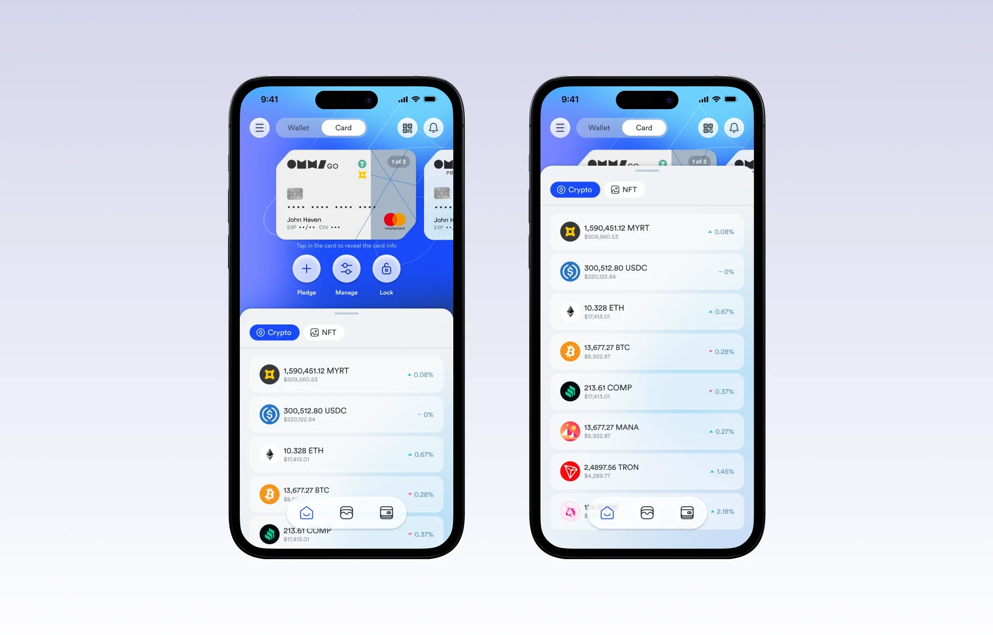
Haven Home Screen Alternative 1
Alternative 2 • considered direction
Floating compact nav; wallet amount collapses, content expands on scroll
More content visible; by compressing the wallet balance into a smaller header, Crypto and NFT content gets more viewport height.
Compact floating menu bar focuses nav on Level 1 features only: Card, Wallet, and Payees / Payors.
Makes fewer adjustments needed to other screens, the pattern is self-contained.
Floating menu + expand behavior adds significant engineering complexity, a real implementation cost the team would need to weigh.
Haven Home Screen Alternative 2
Design decisions & the reasoning behind them
Every layout and interaction choice in this concept had an explicit rationale, driven by the priority pyramid established at the start.
Wallet balance as the hero element
The total portfolio value ($2,285,845.46) is the first thing users need to see. It anchors the entire screen. No greeting copy, no marketing banner, just the number that matters most, styled in large display type with percentage change. Every other element radiates from this.
The 4-action row is always visible
Buy, Receive, Send, Swap are fixed below the wallet card, never hidden by scroll position. These are Level 1 actions. A user arriving to complete a transaction should never have to hunt. The row persists across both the Crypto and NFT tab states, because the action applies regardless of which asset the user is viewing.
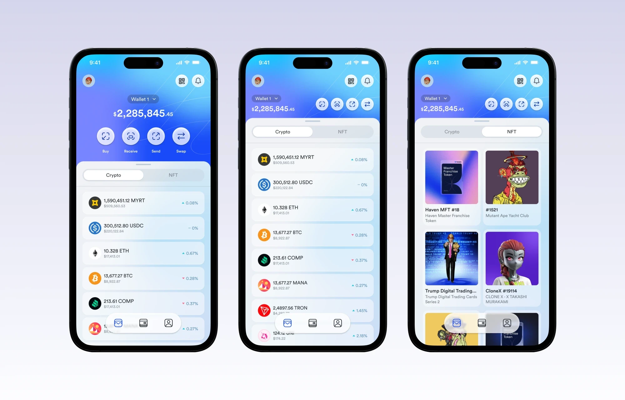
Crypto / NFT as inner tabs
Placing Crypto and NFT as inner tab toggles rather than bottom nav items keeps the home screen unified. Users think of both as "my assets", not two different products. The tab swap is a view filter, not a navigation event. This preserves orientation and reduces the sense of moving between screens.
Card on its own top-level tab
The card section (with Pledge, Manage, Activity) was deliberately separated from the Wallet tab. Card management is a distinct mental mode; users enter it intentionally, not as part of a browsing flow. Separating it prevents the Wallet tab from becoming overloaded and ensures card-specific actions (Pledge, Lock) have appropriate prominence without polluting the trading view.
NFT gallery view vs. list asset view
Crypto assets render as a dense list (token name, amount, USD value, % change). NFTs render as a visual gallery grid. Different asset types have fundamentally different browsing behaviors; crypto is scanned numerically, and NFTs are browsed visually. Forcing both into one pattern would degrade both experiences. The tab switch also toggles the layout mode, not just the data.
Engineering tradeoff made explicit
Alternative 2's floating nav and expand-on-scroll behavior was documented with its cons clearly stated: significant added engineering effort. Flagging this upfront, not burying it, respects the implementation team's time and gives stakeholders the full picture to make an informed choice between the two directions.
How navigation connects (the flow)
The screen flow demonstrates the key navigation paths from the redesigned home screen, showing how users move through asset management, card control, and settings without getting lost.
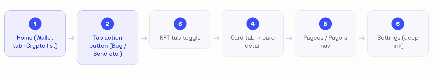
The key architectural principle: no more than 2 taps to reach any Level 1 or Level 2 action from the home screen. The flow was prototyped end-to-end and documented in Figma with annotated callouts identifying which element triggers each navigation event.
Where each feature lives mapping
The redesign doesn't just reorganize; it gives each feature a home that matches how users think about it, with clear ownership at every tier.
What this project taught me
Prioritization is the real design work. Building the 4-level feature pyramid before sketching a single screen was the most important step of this project. It meant every layout decision had a clear, pre-agreed standard to be judged against, not personal taste.
Different assets need different visual grammars. Forcing crypto tokens and NFTs into the same list pattern would have worked, but it would have been wrong. Numbers are scanned; art is browsed. Designing the NFT tab as a gallery and the crypto tab as a list is a small decision with a large impact on how natural the product feels.
Presenting two alternatives is a service, not indecision. Showing both directions, with their pros, cons, and engineering costs documented, gave stakeholders the information to make a real product decision. A single "chosen" design presented without alternatives doesn't give teams the context to push back, refine, or understand what was traded away.
Balance as the anchor is a trust signal. Putting the total portfolio value as the dominant element isn't just hierarchy; it's a signal to users that Haven respects their primary concern. A crypto wallet that buries your balance behind marketing content loses trust before the first interaction.
Engineering cost is a design consideration. Flagging that Alternative 2's floating nav would require significant engineering effort wasn't a disclaimer; it was a design input. The "best" UX that nobody can build is not good UX. Acknowledging implementation reality in the design documentation is how designers build credibility with engineering teams.
Great home screens aren’t about showing more, they’re about making the right things effortless.

Tri Kurniawan
Product Designer