
Metamorpix Logo
Brand Design, Logo Design
Introduction
Inspired by the concept of metamorphosis, we strive to continuously refine and elevate our designs, just as nature transforms from one state to another in pursuit of perfection.
Year
2017
Role
Graphic Designer
Tools
Adobe Illustrator, Adobe Photoshop
Media
Brand Guideline e-Book
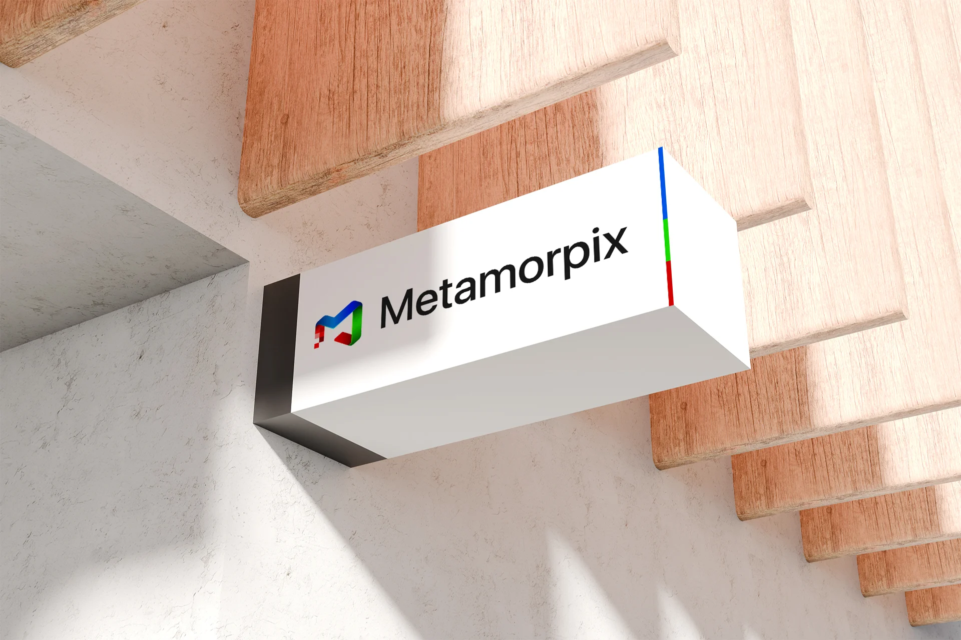
Metamorpix, derived from “metamorphosis” and “pixel,” captures our core belief: great design is a process of continuous transformation. We turn ideas into purposeful, high-impact user experiences by refining, iterating, and evolving them with intention. Much like metamorphosis in nature, our approach is rooted in progress, shaping concepts into their most effective and elegant form.
Our logo reflects this philosophy. Built from the letter “M,” it represents both metamorphosis and the pixel, the fundamental unit of digital creation. The angled form introduces a sense of movement and direction, symbolizing momentum, adaptability, and the ongoing evolution of design.
The RGB color system: red, green, and blue; further reinforces our digital DNA. As the foundation of all on-screen visuals, it speaks to precision, versatility, and creative possibility. Together, these elements form a visual identity that is modern, dynamic, and deeply aligned with how we design: structured at the core, yet constantly evolving at the edges.


